Photo Exhibition #1 - The Crafted Kup
...I'm a bit late on this one.

The Crafted Kup - Circa 2016...after the renovation.
I've lived in the Hudson Valley since I was eight, and It's only been in the last three years or so that I've actually taken the time to explore it.
Towards the end of 2014, The Crafted Kup was recommended to me as a suitable location for a first date with a girl I had been talking to online (which went incredibly well, I might add). At the time, the place was only one narrow hall, furnished with a hodgepodge of second-hand couches and chairs in a variety of different styles. There was artwork hung on the wall in no particular layout or pattern. The place was quaint, but I didn't pay much mind to it at the time...it certainly wasn't my primary focus that night.
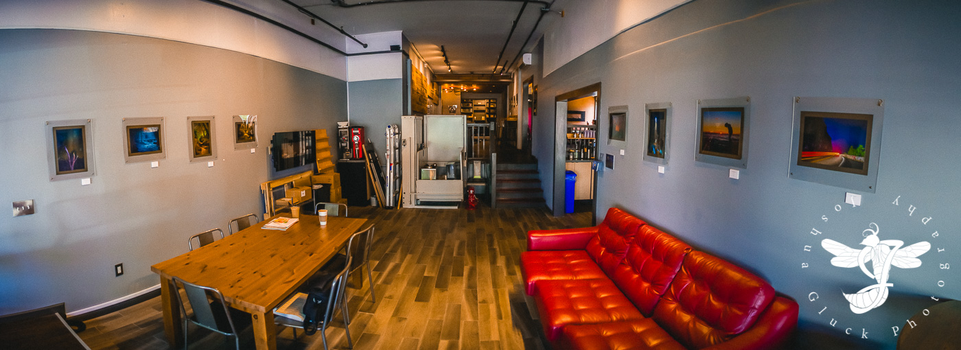
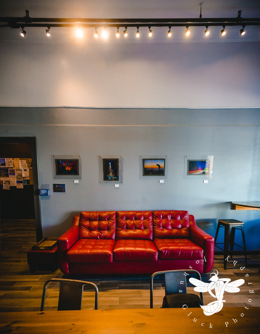
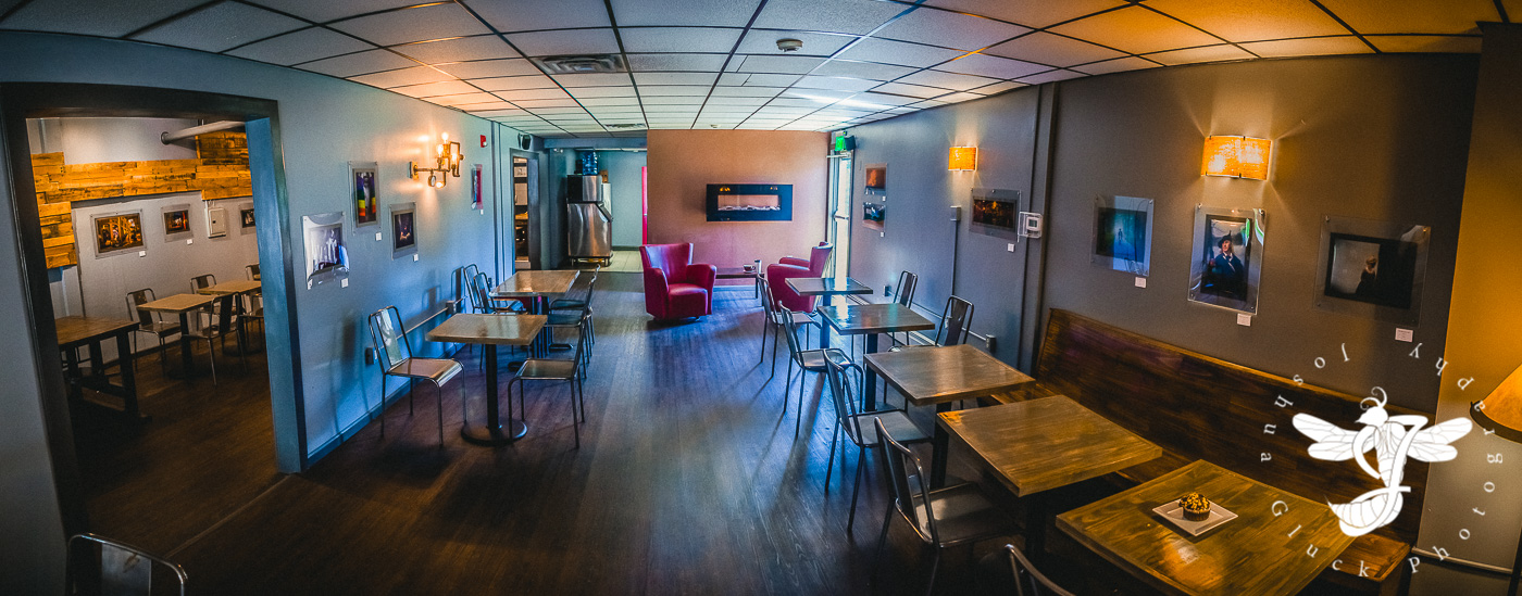
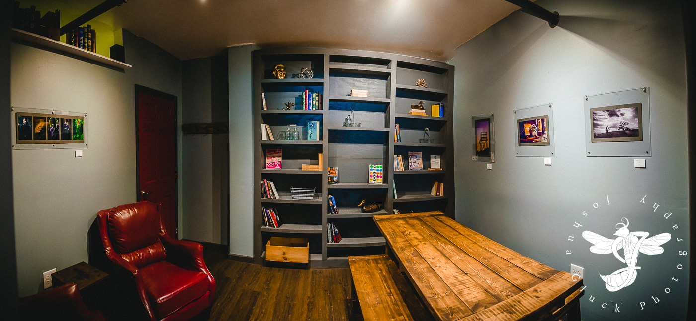
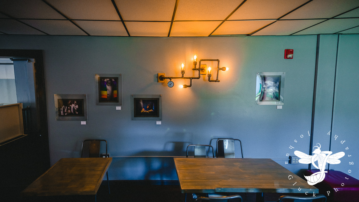
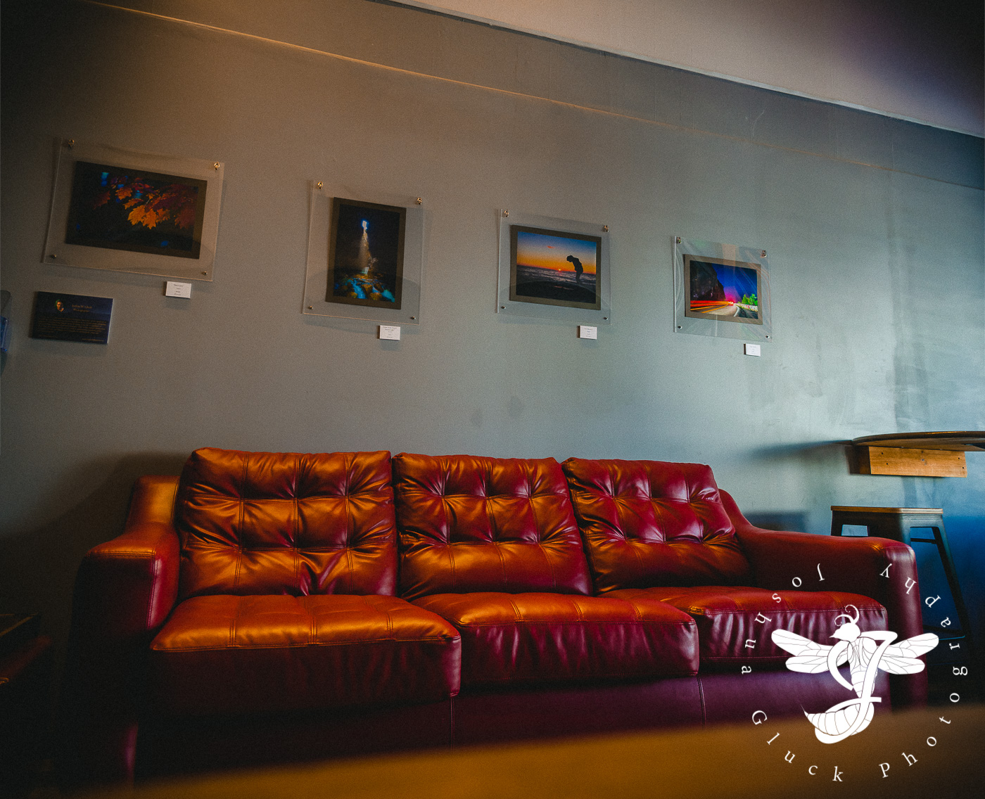
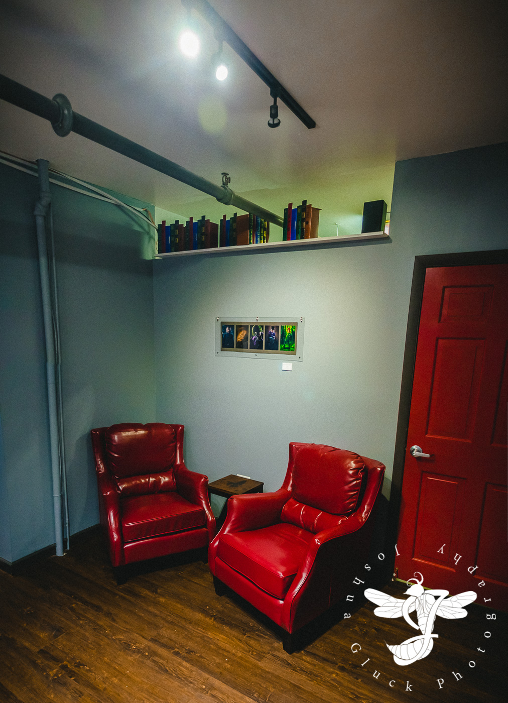
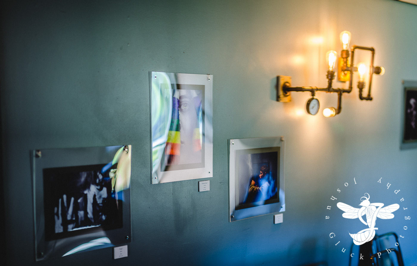
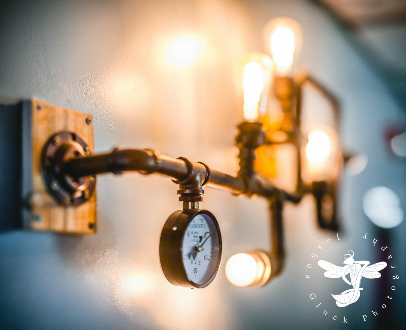
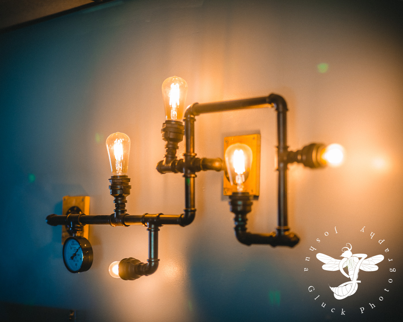
I returned to the cafe nearly a year later (2015), when they were in the midst of a dramatic renovation. Gone was the raggedy furnishing, and in its place were shiny metal chairs, laminated wood tables, steampunk-esque Edison light fixtures, and flat, slate blue walls. If that wasn't drastically different enough...the owner, Tanner, had purchased the location next-door and expanded the cafe into it, easily doubling the size of the place, making room for more tables, leather couches, and a reading area.

The updated aesthetic...
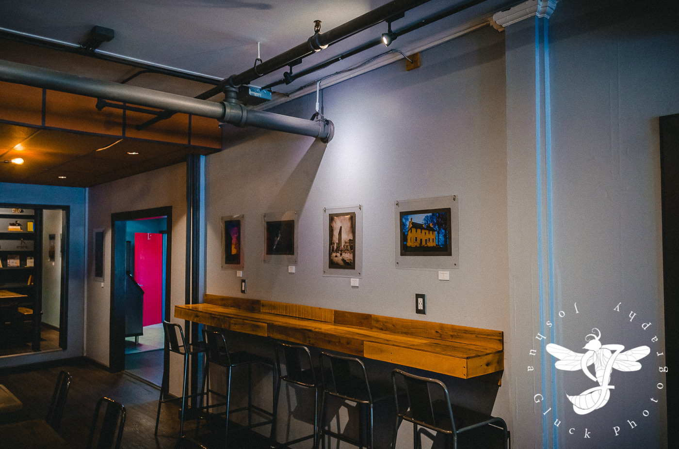
There was certainly a significant amount of additional wall space, complete with track lights spotted around the ceiling...possibly intended for the eventual display of local artwork.
During the period of mid 2015 into early 2016, my interest in photography, which had up until that point been merely a past-time, increased dramatically. I spent many early mornings and late afternoons searching for interesting landscapes and architecture. By spring 2016, I had a largely usable portfolio of new images, and I also devoted time searching through older photos and re-editing them to match the quality and aesthetic I had developed over the years.

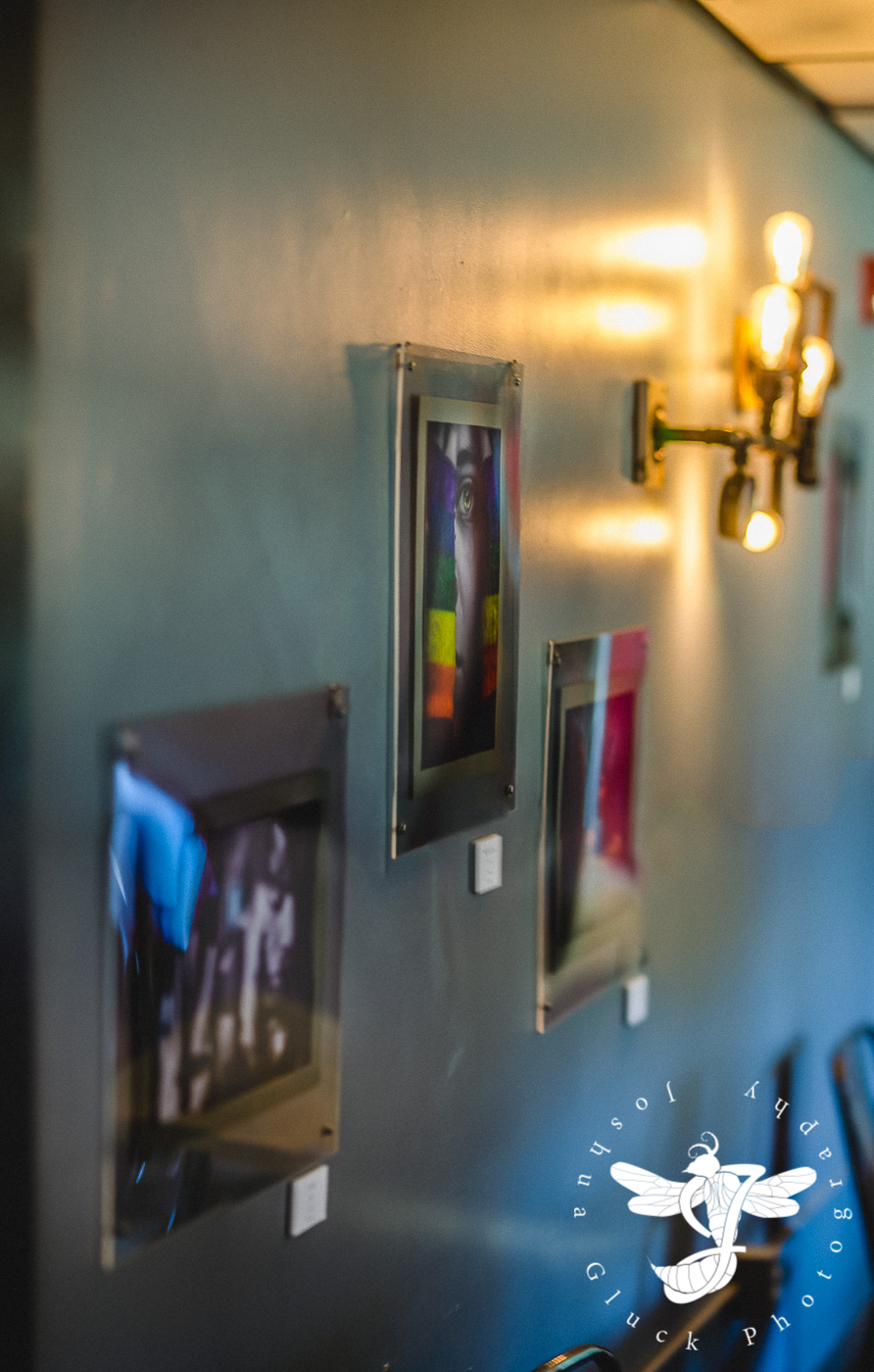
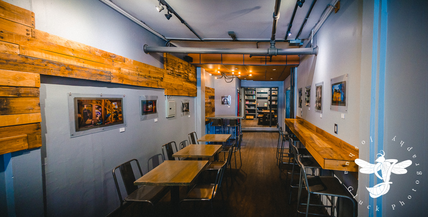
This particular show consisted of 30+ photos spanning seven years of work (2009-2016).
In mid-Spring 2016, I approached Tanner about potentially displaying my photography in the not-too-distant future, and he was fortunately very accommodating. What followed were several busy, somewhat stressful months trying to put together my first photography exhibition. May I just say...what a learning curve.
There was quite a lot to work on in a somewhat short amount of time:
1) Selecting a reasonable amount of photos for display out of over a hundred.
2) Finding and testing a reputable professional printing service.
3) Framing...which I'll get into momentarily.
4) Retrofitting my long-outdated website to accommodate a photography shop.
5) Designing business cards and pamphlets.
6) Designing a logo for said business cards and pamphlets.
7) Price Cards
Tasks 1, 2, 4, and 7 went reasonably smoothly...if perhaps a bit tediously.
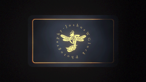
My logo was actually finished in one very long night. I wanted to use the Tarantula Hawk Wasp idea I had developed in college (I'd be damned if I used a lens, camera, or aperture design)...but how to implement it? I realized that if I angled it correctly, the wasp's body silhouette could actually be shaped into a "J", which was fitting enough. Over the next few hours, in between working on some of the other list items, I'd return to the wasp and send out my latest version to several people for feedback.

The progression of my logo over the course of a single afternoon/night.
Iteration 2 lacked any interesting detail, and the stinger was described as "too aggressive". It was also mentioned to me that the wasp by itself didn't read as a "J" as well as I was hoping. After some experimentation, I was able to wrap a cursive "J" around the wasp like a ribbon, making the whole design flow a bit better. Some detail work later, and VOILA! My first proper logo.
Now for the business card...
Back in 2012, at good 'ol Full Sail University, we had a preparatory class just prior to finals in which we were required to design all sorts of branding items, such as business cards, dvd cases (I suppose I'm dating myself here), and website layouts.
My half-hearted 2012 business card mockup.
These never amounted to anything though, due to my "break" in the years immediately following. This time, a full 4 years later, I needed to give the design some more serious thought.
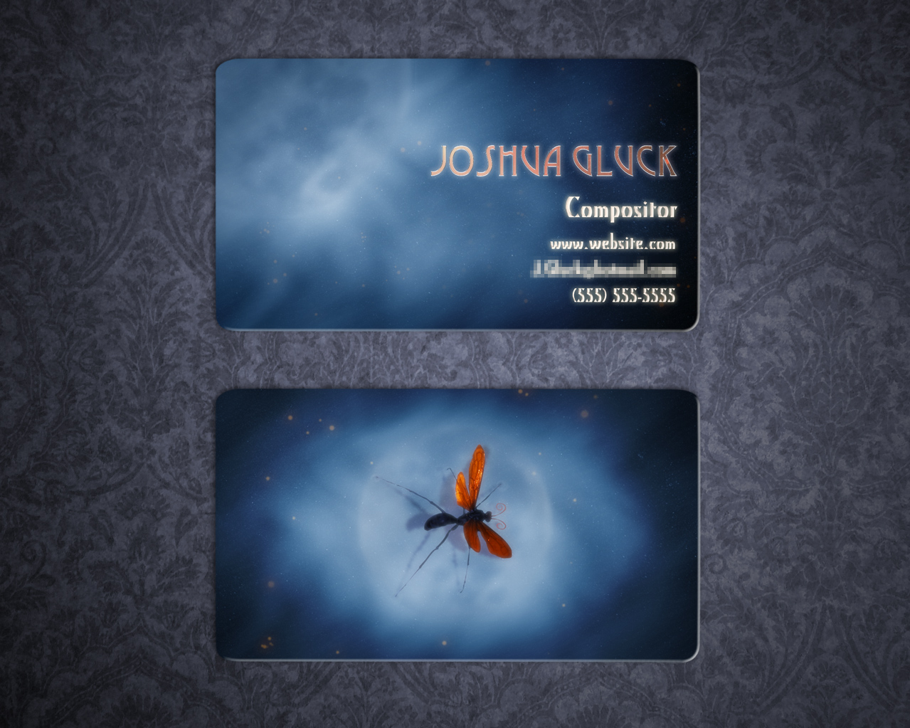
In the 2012 version, I had always planned to have the wasp's orange wings printed in gold foil. For the new design, I expanded that idea to the whole logo, as well as the lettering. I also liked the blue/orange contrast, so I maintained the general aesthetic and color palette of the background...albeit making it a bit simpler. In addition, I thought it'd be handy to have an easily scannable, custom QR code on the back that linked directly to my website shop.

The printing process required the gold foil stencil and image backgrounds to be submitted as separate files.
Naturally, I pre-vized the design using MAYA.

The final product (a newer iteration incorporating VFX promotion).
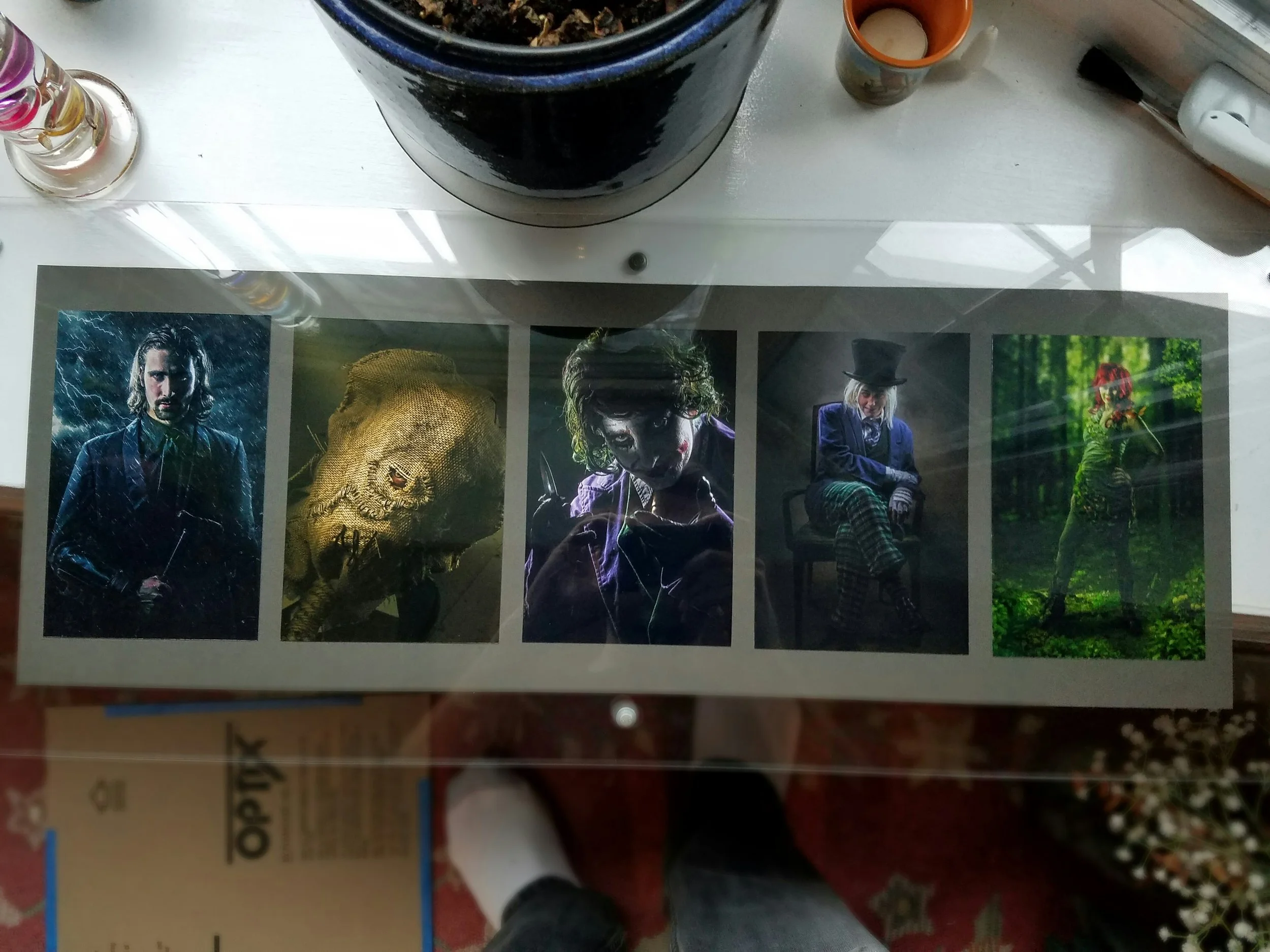
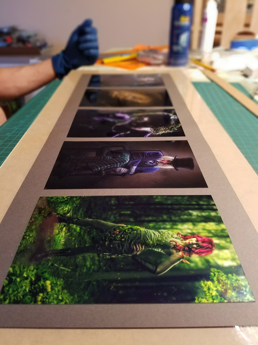
The price cards were trivial. I batch exported all of the titles and prices into a few sheets, which were then printed onto cardstock, glued to foam core, and cut out into their final rectangular shapes.

My stack of completed price cards...perhaps the easiest thing to design for the event.
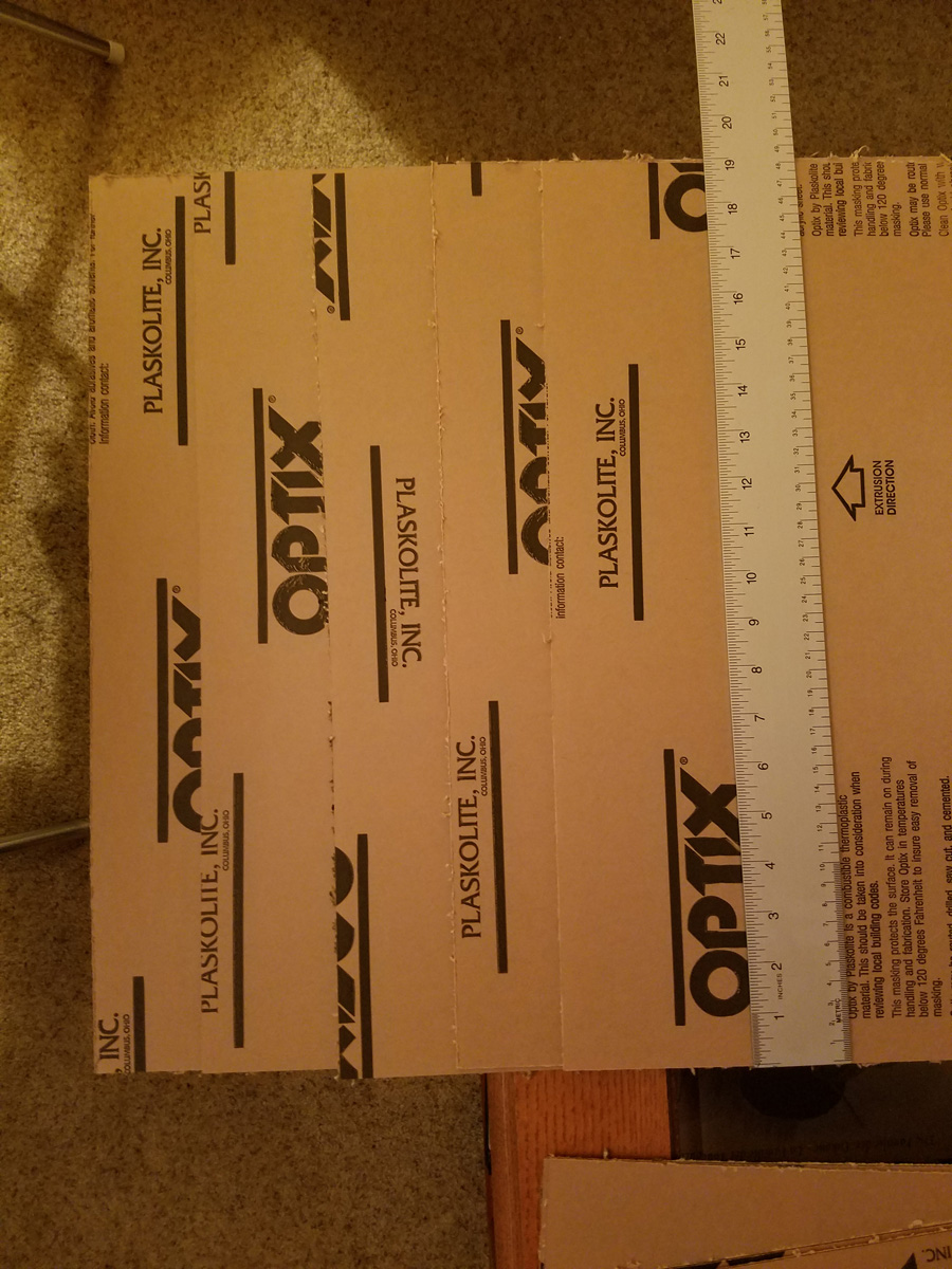
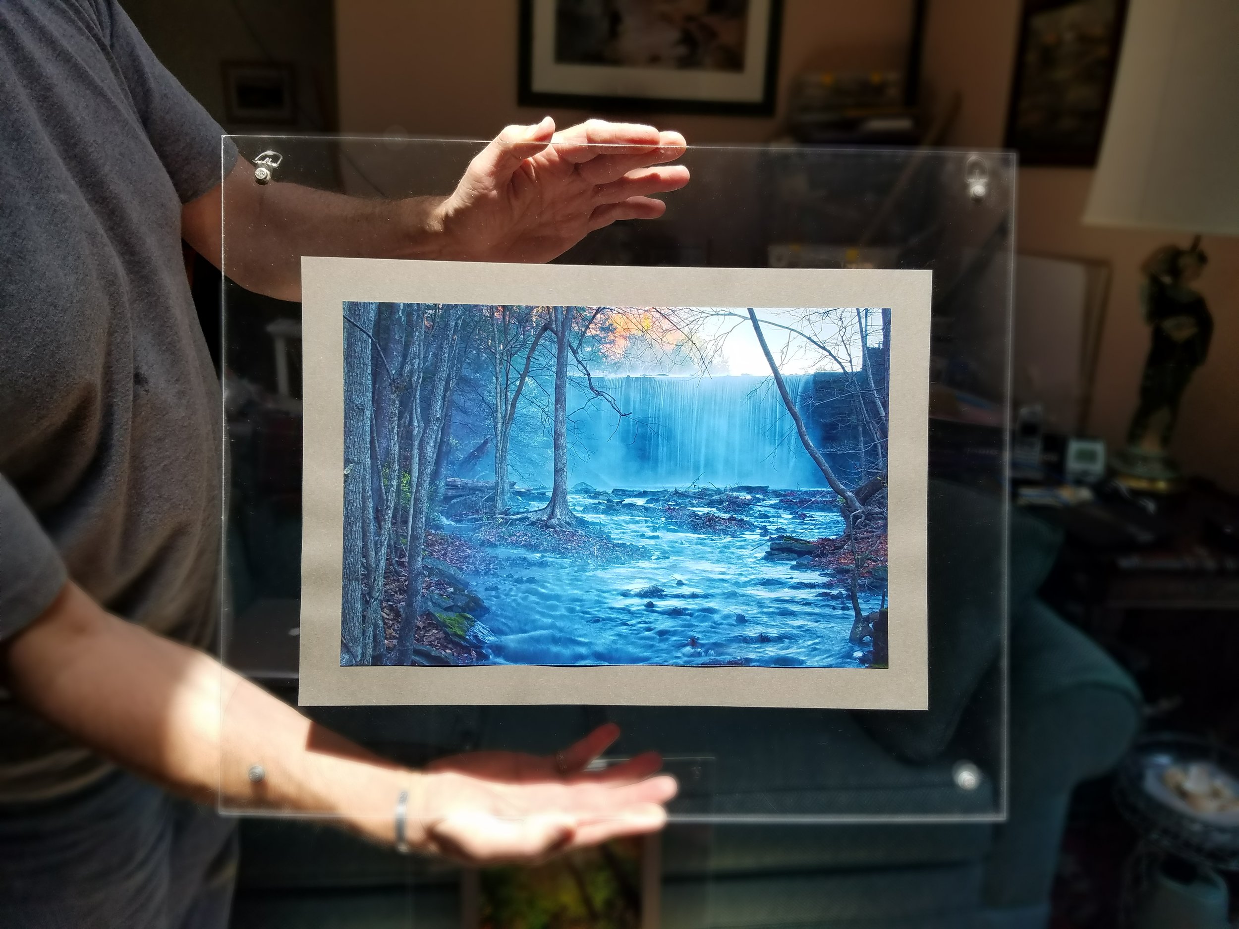
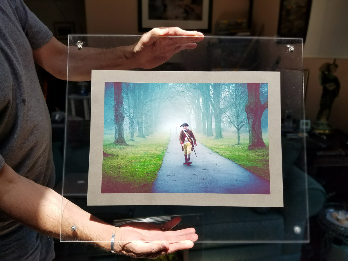
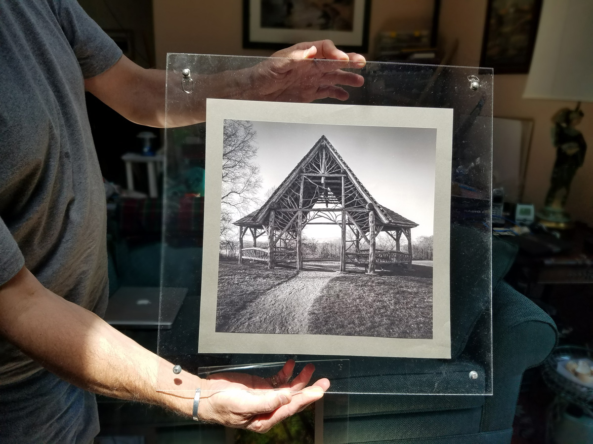
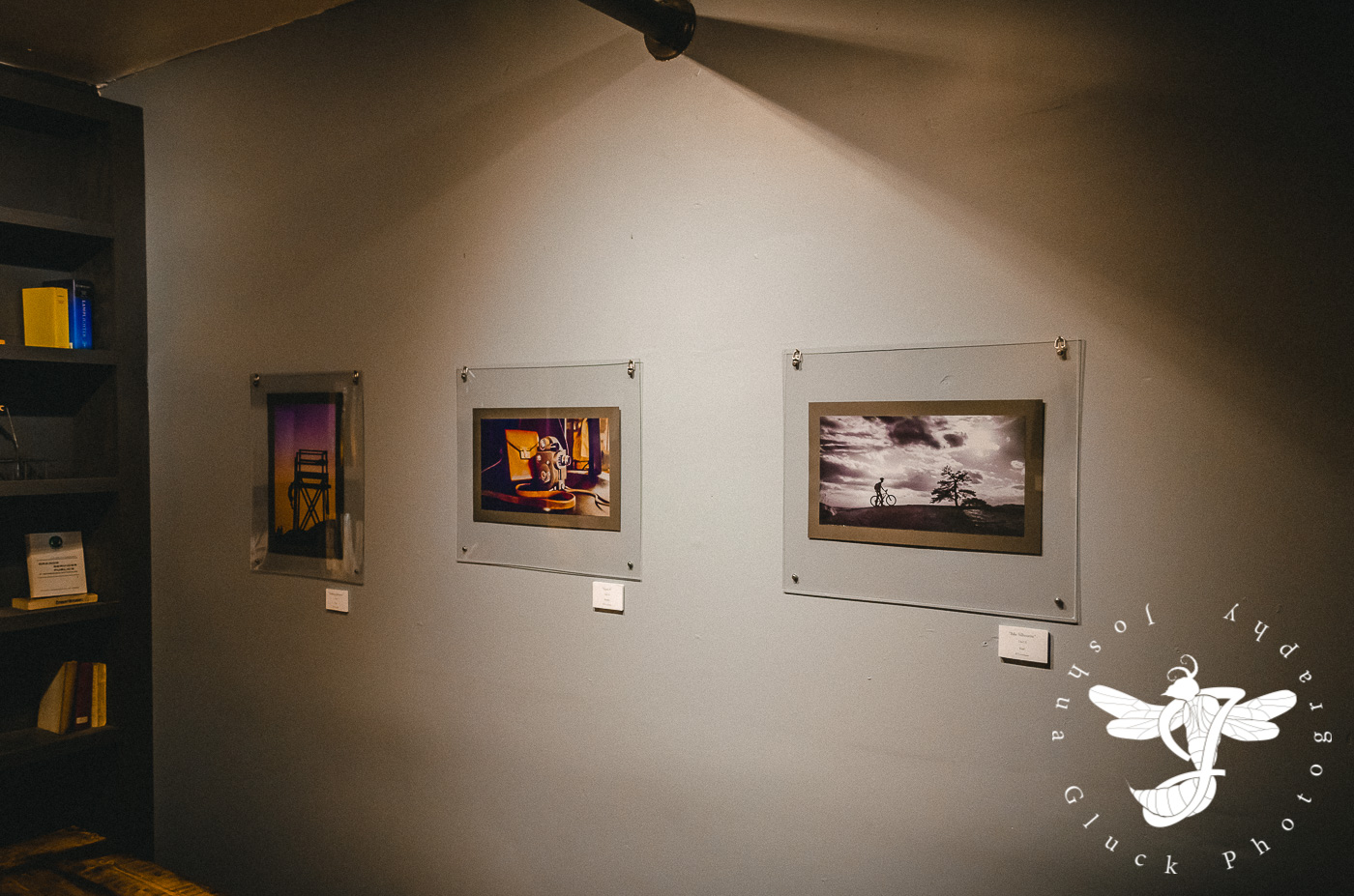
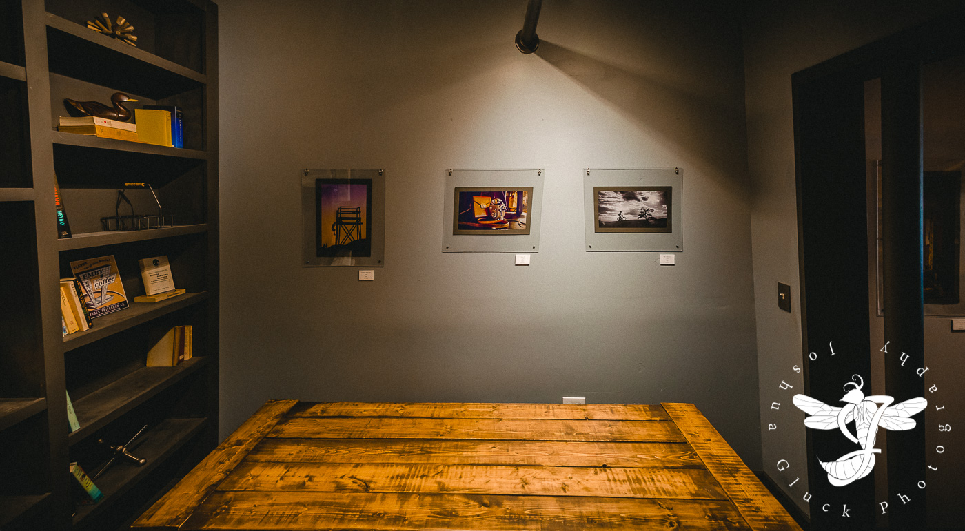
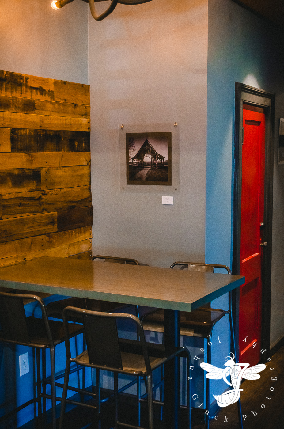
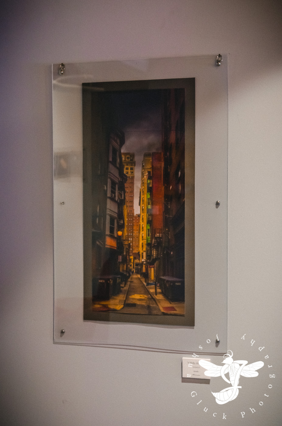
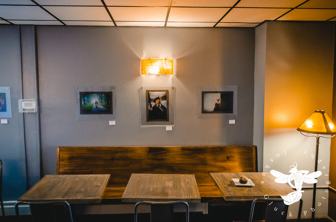
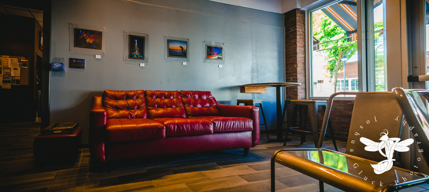
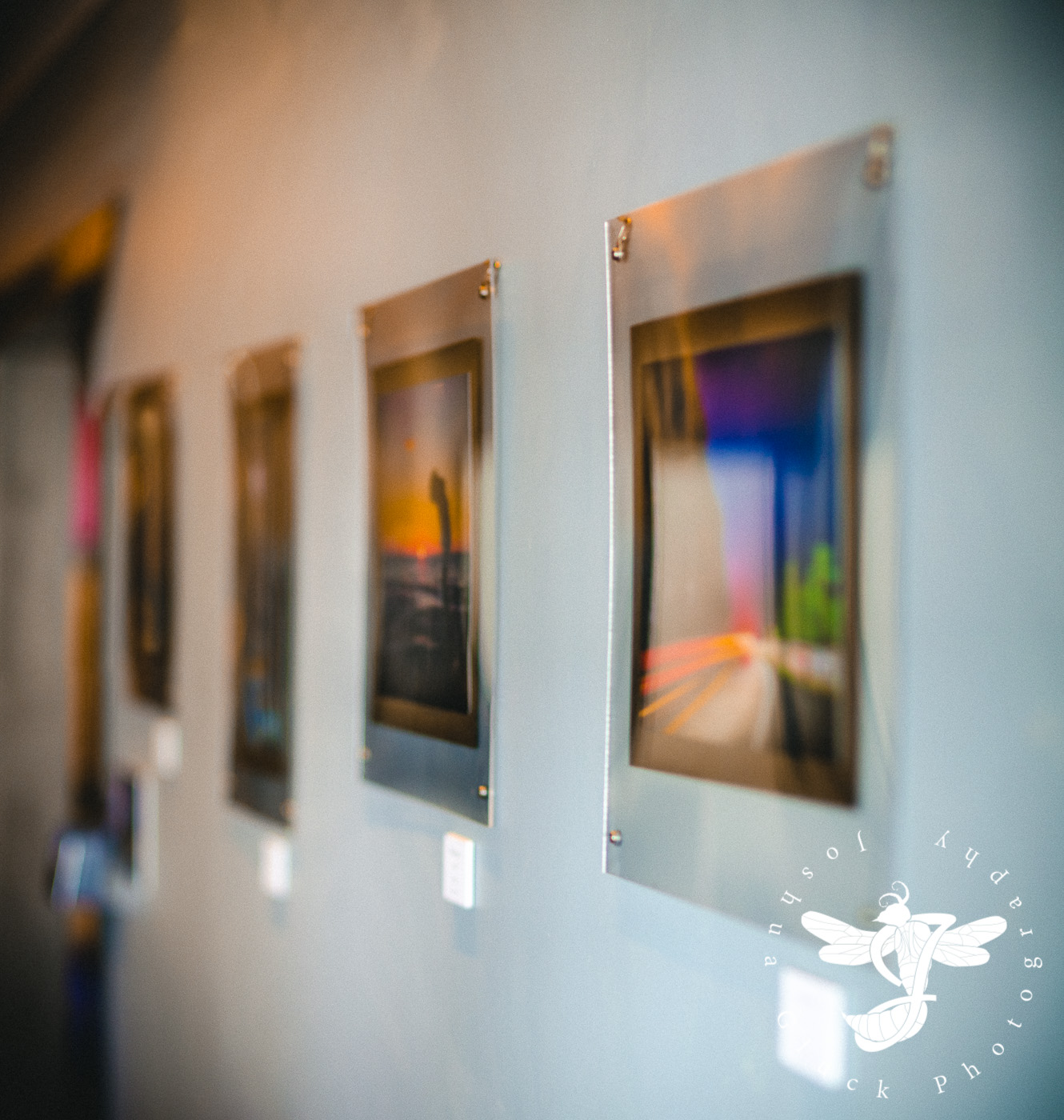
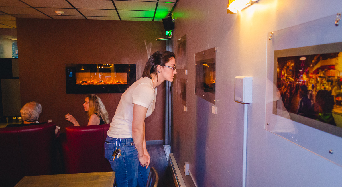
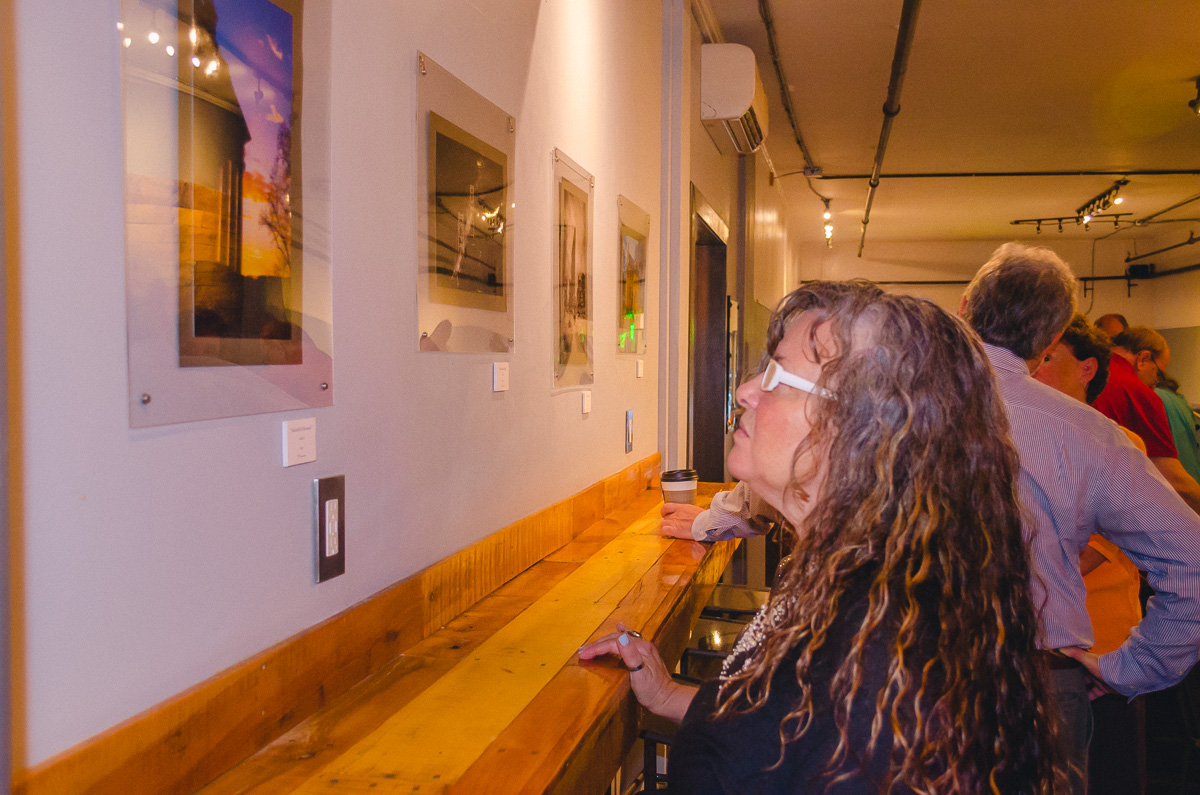
With the business cards and price cards complete, the primary task left was the framing. I had intended to buy basic, everyday frames for the sake of price and simplicity. However, my ex-photographer father (who was in the business professionally for 27 or so years) insisted on designing something more unique. He wanted to suspend the prints between two sheets of acrylic, giving them a modern, sleek, floating appearance. After a lot of nagging, I relented...so following a mind-numbing amount of measuring and planning, we purchased a plethora of acrylic sheets and got to work, drilling out screw-holes in all four corners of every single piece. Each print was very carefully stuck onto a specifically picked gray paper backing, and then sandwiched between the acrylic. Even the screw-heads were carefully chosen to match the aesthetic. The entire process took us several days to complete the 30+ prints.
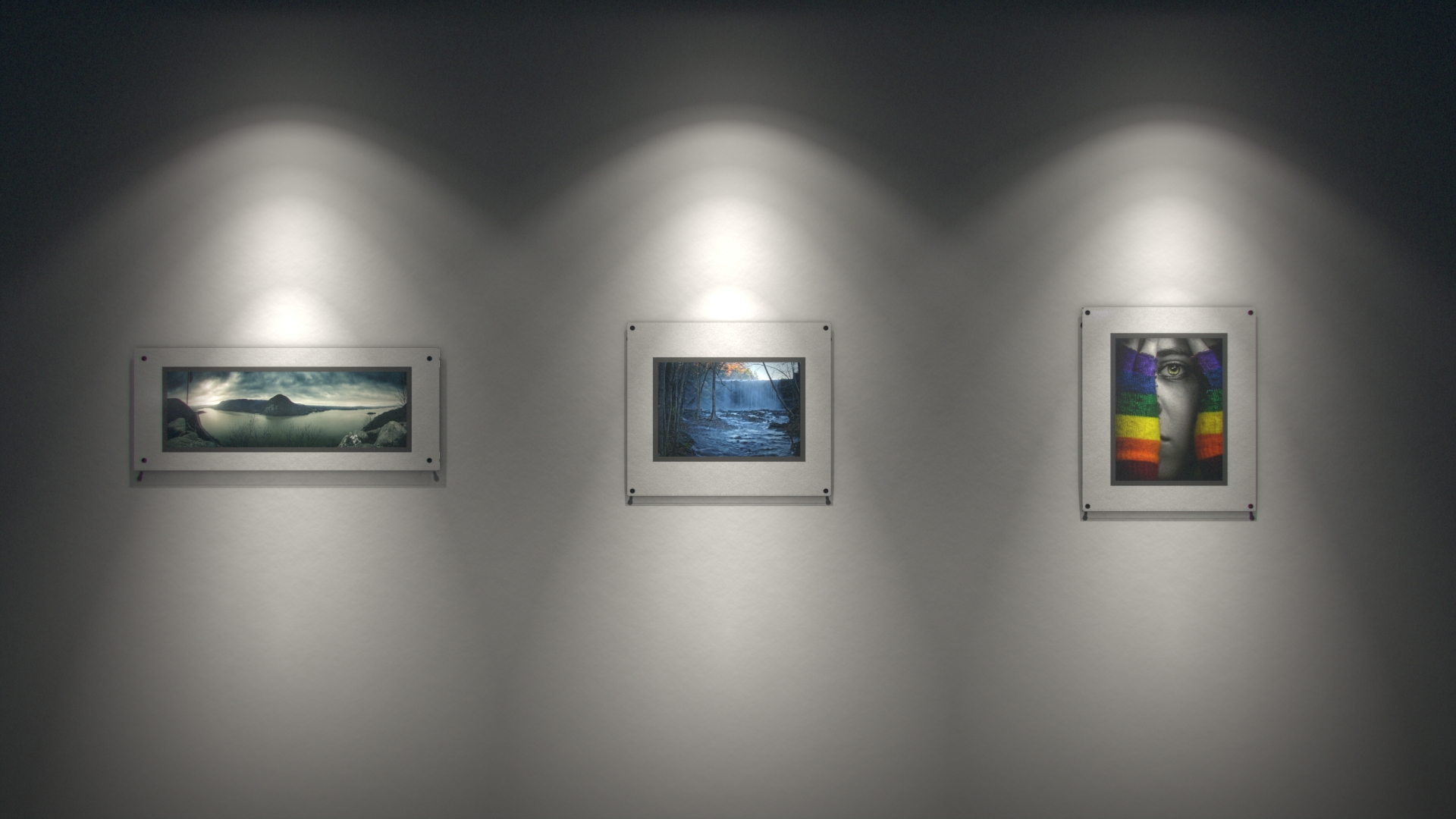
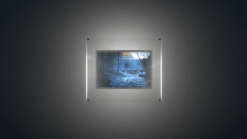
More pre-viz!

It was very relieving once we finished the first pictures. It's nice when a plan works.


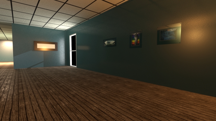
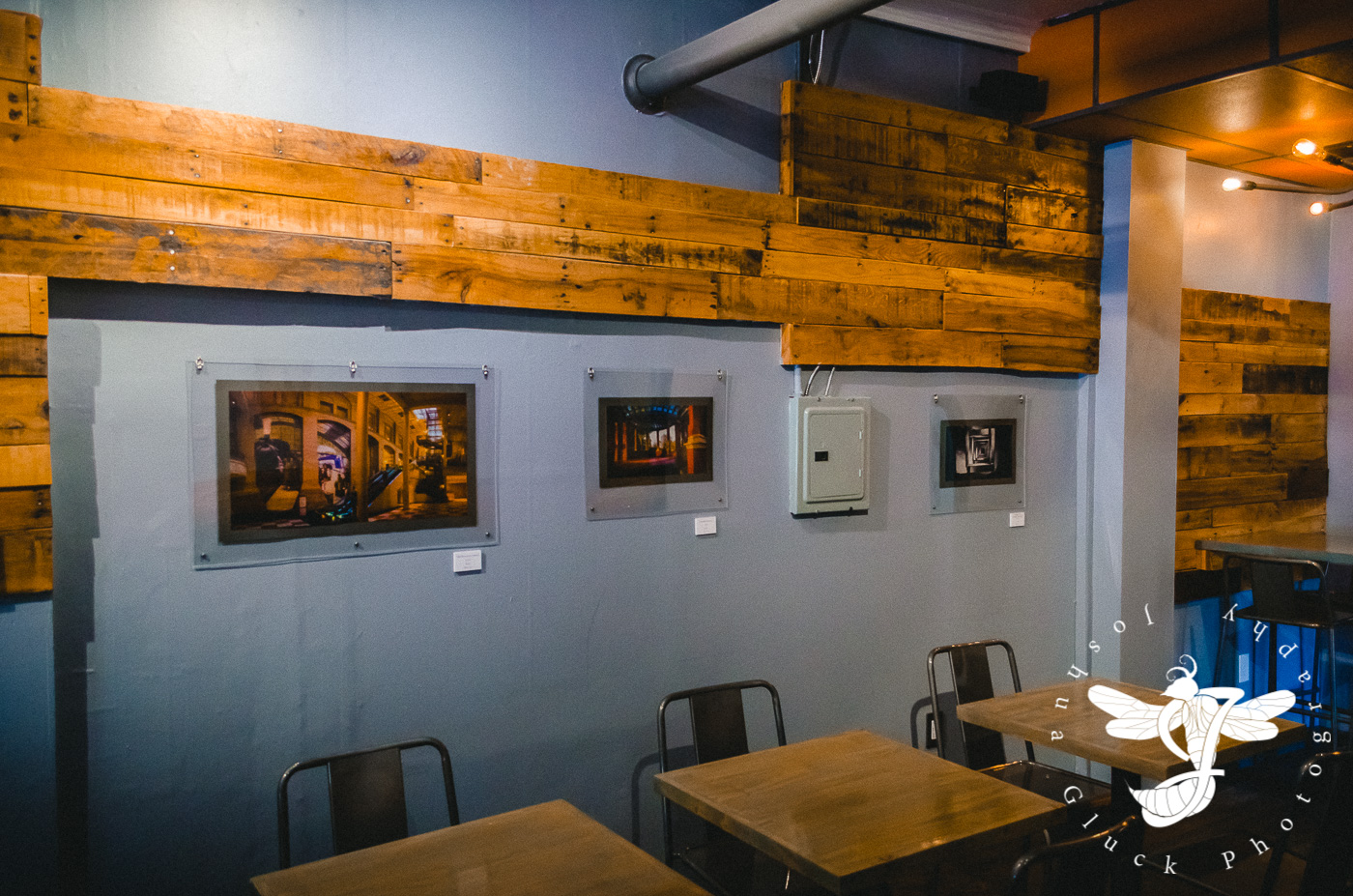
With all the photos successfully framed, my father and I traveled to the cafe on a quiet night in July, and hung everything on the walls. Two nails for 11x16 photos, three nails for panoramas. Are they level? Equally spaced? Grouped correctly? There was much to consider...the whole process took upwards of 4 hours...well past closing time.
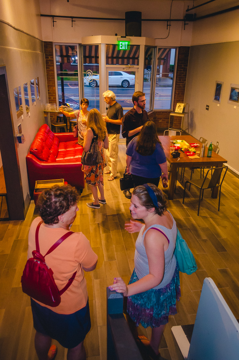
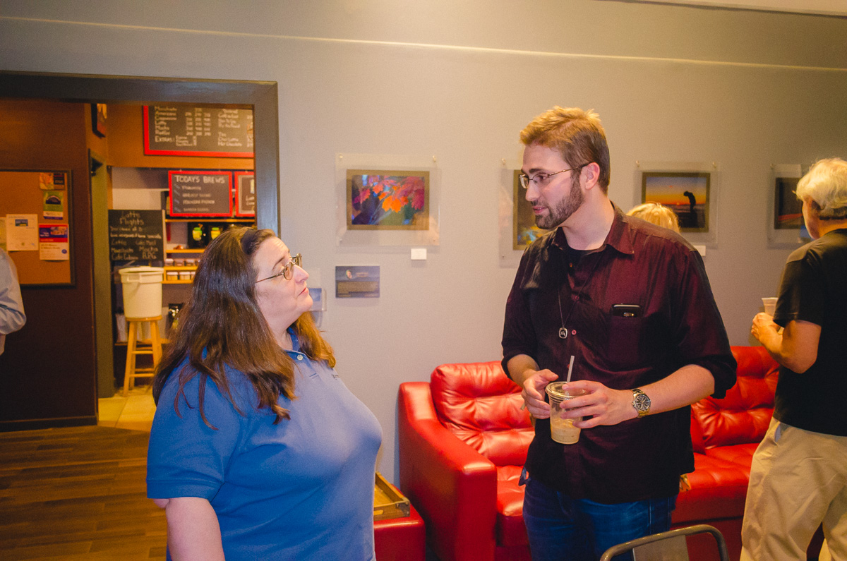
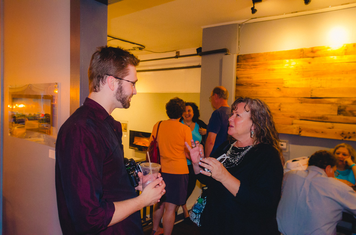
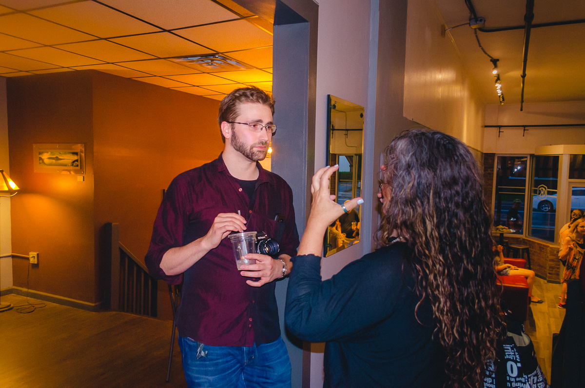
And with that out of the way, my opening reception took place the following weekend, and the prints remained hung until early September.
8 prints sold. 👍

The remaining prints are, as I write this (2/18/17), hanging in a different cafe further north. I'll write more about that (and more briefly) in a separate blog post.
Was this experience rewarding? Certainly. Will I just use normal frames the next time I have to start over? Yes. Or I'll have a professional service bond the prints permanently to single acrylic sheets. Either way, I'm happy this work is behind me.