

The Tower - Part 1
In February of 2012, I was approximately 80% of the way through my time at Full Sail University. I had entered in August 2010 as a reasonably slim-fit individual, with high aspirations and a lot of energy. By the time of this project however, I was long-haired, bearded, significantly thinner (a likely result from a poor diet and lots of biking), and beyond exhausted...having slept little over the last year...spending almost every waking moment trying to stay ahead of the workload.

The Full Sail workload does strange things to a person...
At the time, "finals" was divided up into 5 classes, spread out over 5 months:
(Month 1) Project pre-planning.
(Month 2) Projects 1-3 (roto, keying, & tracking).
(Month 3) Project 4 (matte painting).
(Month 4) Project 5 (projected card systems).
(Month 5) A class to add some "final polish" and assemble our demo reels.
We had the freedom to choose the footage and scenery, but each project was required to focus on a different skill set (roto, keying, projection, etc). While this made sense for demo reel purposes, in hindsight I feel like it tied my hands a bit. When working on a real-world project, one usually uses the technique that best fits the shot...not the other way around.
Planning for the first four projects was pretty straightforward. I had already thought of several shots well in advance, drawing inspiration from films such as "Sin City" and "The Spirit". The last project eluded me, however. Our first progress check was rapidly approaching and I was definitely panicking. After scrolling through pages and pages of stock images, I came across a mountainous valley and somehow a connection formed in my mind with a sequence I had seen in the trailer for the film "District 9", in which a squad of helicopters slowly approached a massive alien spaceship looming over the city.
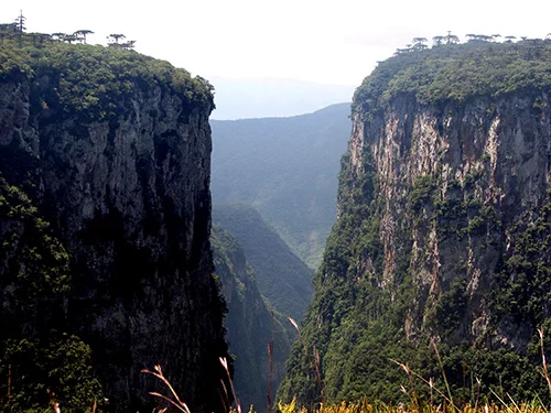
The stock photo of a valley.
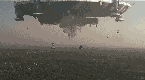
The inspirational sequence from "District 9".
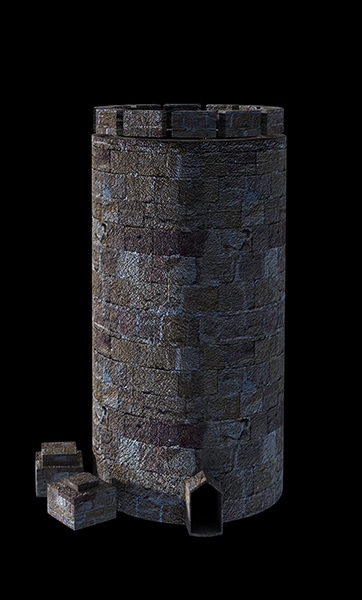
Within the valley of the stock image I pictured a giant, weathered tower of unknown origin or purpose. Human-made...perhaps a government project, I couldn't say.
In the sequence, I wanted a bi-plane to fly past the camera towards the tower. I figured I'd render out the plane in 3D (the "hero" model and separate background model(s) sourced online, being re-textured and rigged by me), and do the rest using a matte-painted card system...as per the requirements. I made a crude, sorry-looking mock-up in Photoshop, and combined it into a matte painting using several of the stock images I had found, and then animated a block-out of the sequence. That first iteration didn't go over so well in review. While they were supportive of the general idea, my teachers weren't very complementary regarding the tower design. Frankly, I don't blame them...

The very first iteration of my tower scene.
The first version of the animation, submitted for panel review.
I returned to my classroom slightly dejected...still panicking. I can't say for sure exactly how much time passed, but after a large amount of brainstorming, another shape appeared in my head...this one much more vivid and interesting than the last. I grabbed the first piece of paper I could find and rapidly sketched out the shape. One of the teaching assistants happened to be walking by at the time, looked over my shoulder, and enthusiastically voiced his approval.
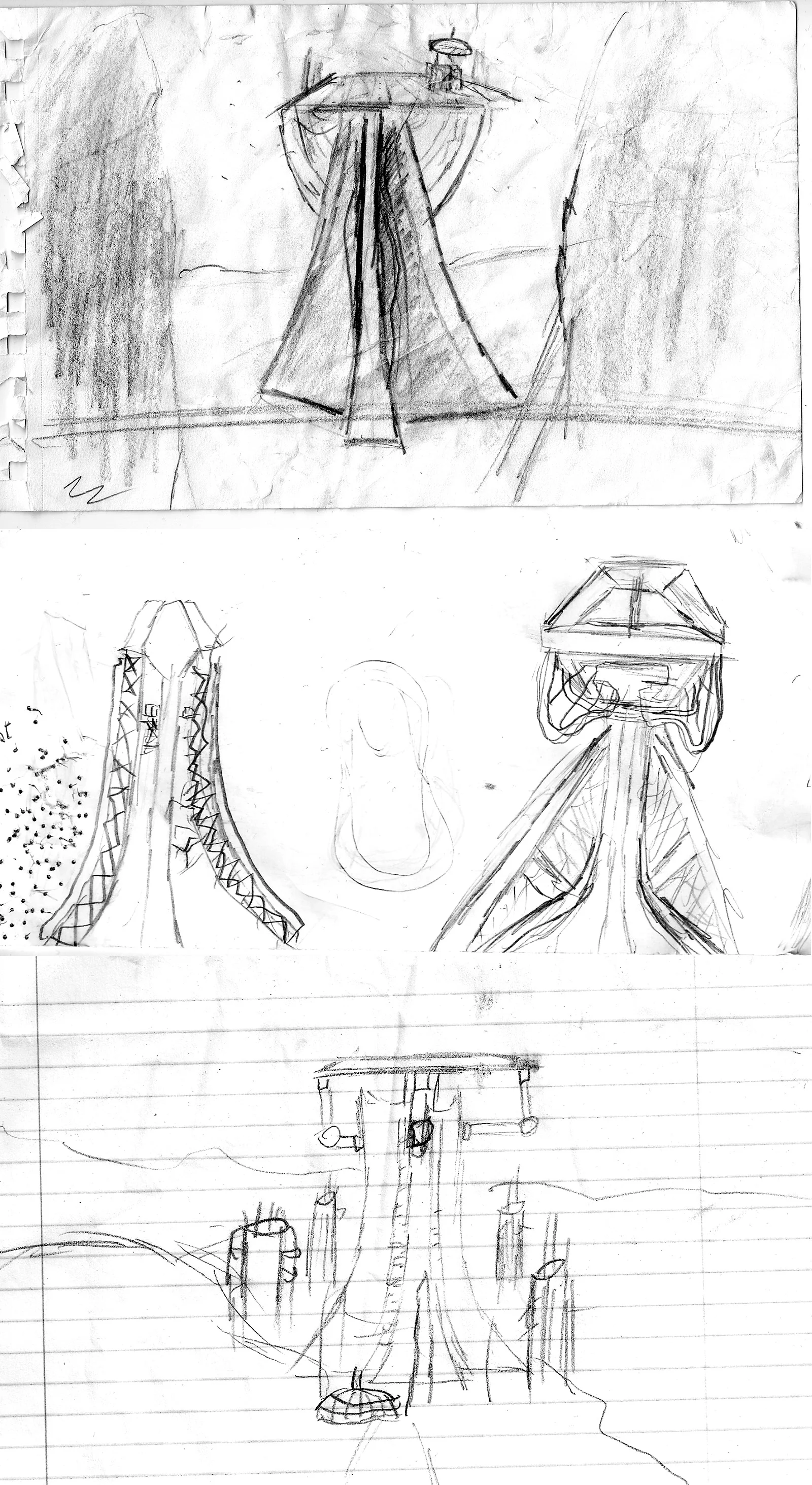
The initial sketch and the idea's progression over the course of the project. Crude, yes...but they got the point across and gave me a great starting point to work off of. Also, I'm amazed I was able to find these as quickly as I did. +1 for organization!
Now having a much better direction to go in, I roughed out a model and continued working on my matte painting. I also decided to create some auxiliary structures surrounding the primary tower in order to help flesh out the scene. By the next panel review, I had made a significant amount of progress.

The first modeled version of my Tower, along with the auxiliary buildings. I'm not going to lie...I don't know what the function of the giant tubes was.

The second style frame for review...now complete with a half-decent looking tower and re-textured biplane.
The second version of the animation, submitted for panel review.
This iteration of the project was much more well received, but there was still a ton of work yet to be done. The panel felt that the tower still lacked a bunch of detail, and I also wanted to create a few larger surrounding "side towers" (as seen in the third drawing). The majority of the work on the latter, however, would have to wait two months, as the other projects took precedence. I was able to bring the main tower to a satisfactory level though, as well as creating some quick particle simulations in Adobe After Effects to further populate the sky with distant biplanes...and finished that class receiving a relieving amount of praise.
The final version of the style frame submitted for the first month of finals.
A turntable of the biplane rig. This particular coloration was made as a loving joke for one of my friends. It's colored as the "Bi-sexual Pride" flag, making the "Bi-Plane" a bit of a double entendre.
Other colorations included a flat blue, yellow, and red.
The following two months were incredibly rough. I completely burned out after the first month of actual project work...it was really the rotoscoping that did me in. I spent nearly half of the following month not working on a single thing...existing in a daze. Eventually I was able to recuperate a bit, and still managed to pass that class with a B+ somehow...
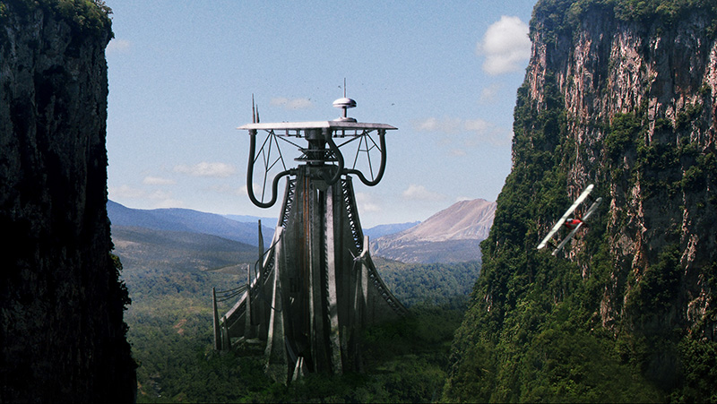
Finally, in April of 2012, it was time to resume the tower project. With the majority of the main tower done, my focus turned to the side towers and other auxiliary pieces. My earliest iteration was incredibly medieval-looking and barely fit with the aesthetic, but I found a way to take the general shape and turn it into something futuristic, complete with landing pads for the aircraft. Would a biplane be able to land in such a set up? No, absolutely not...but I had limited time and frankly, it looked pretty cool regardless. Each building was rendered as a still image, along with shadow passes that'd I'd composite over the valley within Photoshop.
The very first iteration of the side tower. It was way too primitive in comparison to the rest of the scene...but the castle-esque shape would evolve, as seen below.

The finalized side tower, and an auxilery tower that would be embedded into one of the cliffs.
The main tower itself was generally left alone modeling-wise. I didn't have the time, skill, or resources to texture it in 3d, so I rendered out an ambient occlusion still image, and applied 2d textures in Photoshop. The whole tower (and all of the other structures) were projected onto a series of 2.5d cards in Nuke, which allowed a small amount of parallax, and fulfilled the project's requirements. I did manage to render out the small wind turbines separately, however...which created some movement in the otherwise static scene. This was not the ideal set-up...but I'll get more into that later on. I also projected the two cliffs onto bent cards in the camera foreground, so they'd move away to reveal the scene.

The final "textured" main tower. This was projected onto a card in Nuke.

The breakdown showing all of the separate cards in 2.5d space.
With the addition of a few additional 3d foreground planes, and some projected 2d particle planes for the background, I brought the project to a personal "satisfactory" level pretty early on during the month, and used the rest of the time to try to unwind a bit in preparation for the demo reel creation that'd follow.

A "finalized" still-frame of the project. I experimented with a smoke trail following the biplane, but I couldn't make the movement work in time for the complete render turn in.
The tower project as submitted in April 2012.
Ultimately, while this project has always been the "centerpiece" of my college demo reel, I've never been completely satisfied with how it came out. I couldn't get the foreground mountains to look properly three-dimensional, the tower seemed a little sloppy, and the whole scene was too static.
Now, 5 years later, and 5 years more experienced, I wanted to take a crack at it again. Part 2 will discuss the redesign of the shot and primary assets, including all of the towers and replacing the biplanes with the hovership. Part 3 will go into comping all of those assets into the final shot(s), but as of the time I'm writing this, I haven't gotten quite that far yet. But here's a preview of what's to come in the meantime:

A work-in-progress render. NOT FINALIZED!

The new and much improved side tower.

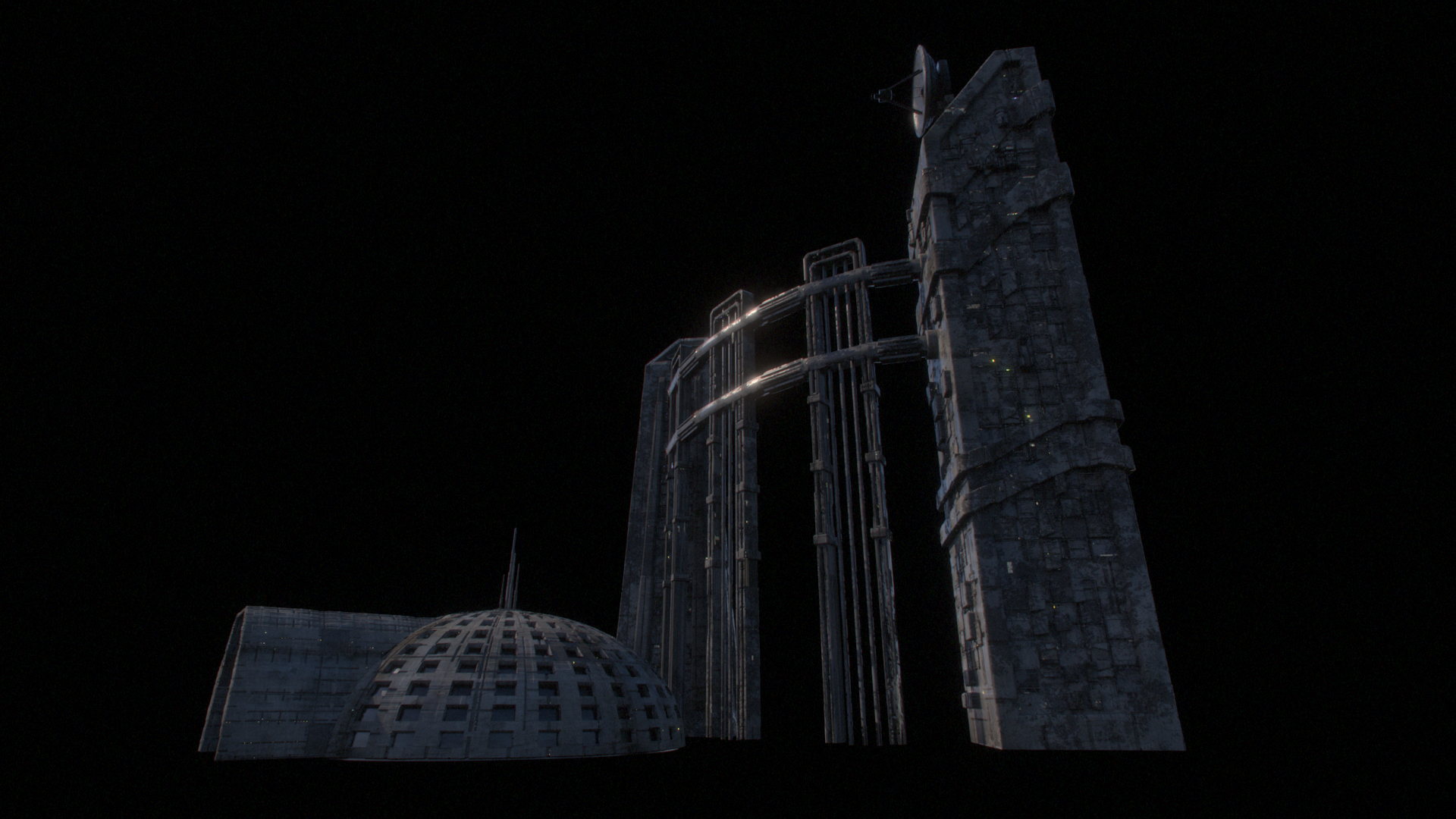
Some of the new auxillery buildings.

The hovership...replacing the bi-planes.

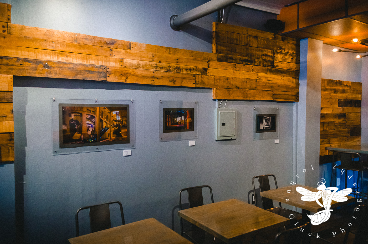
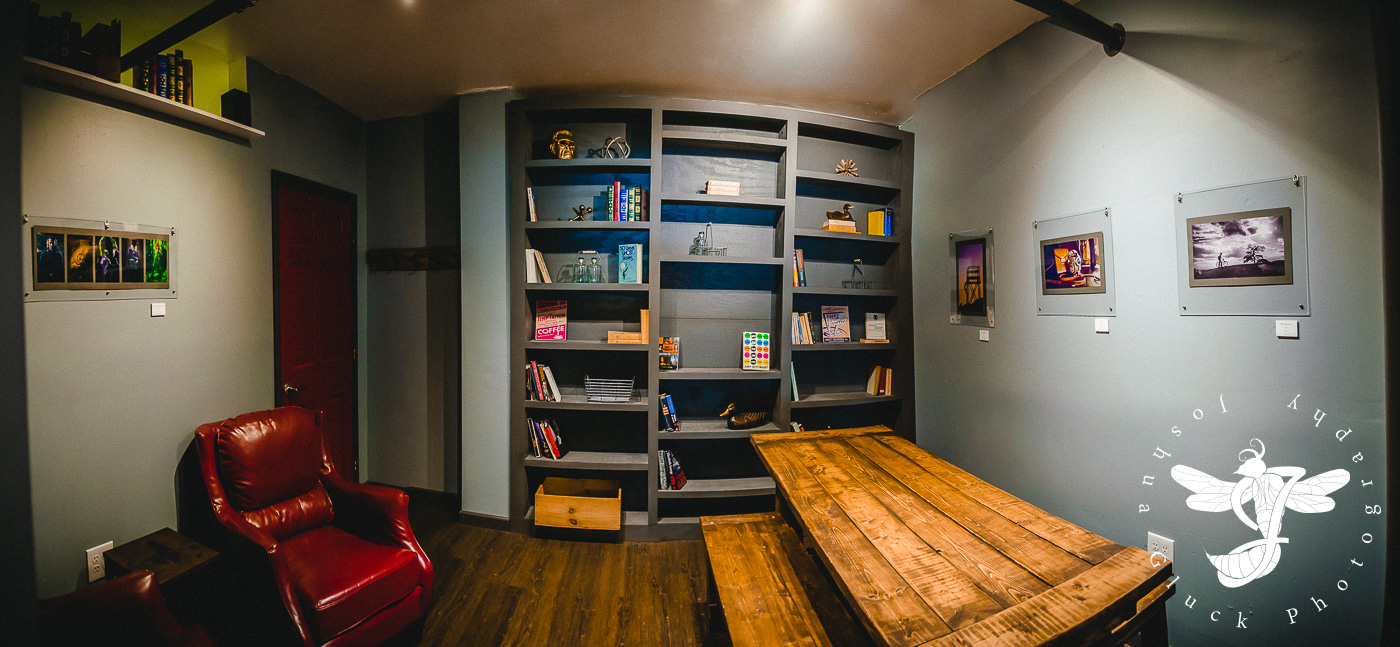
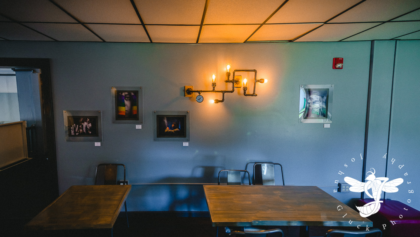
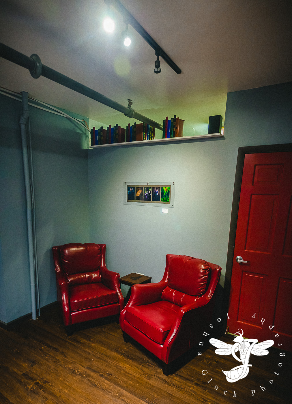
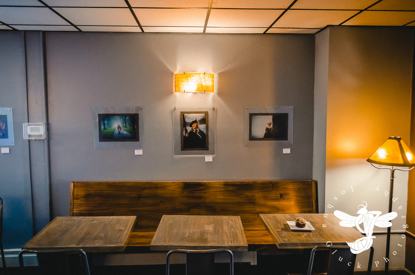
Photo Exhibition #2 - Taste Budd's Café
Displayed during February and March of 2017.

Invigorated by my somewhat-successful photography show at the Crafted Kup (wherein I managed to sell a number of prints), I recalled another prominent cafe that displayed local artwork...a cafe which I had only been to once before in 2014...on a date (a bit of a trend, it would seem).
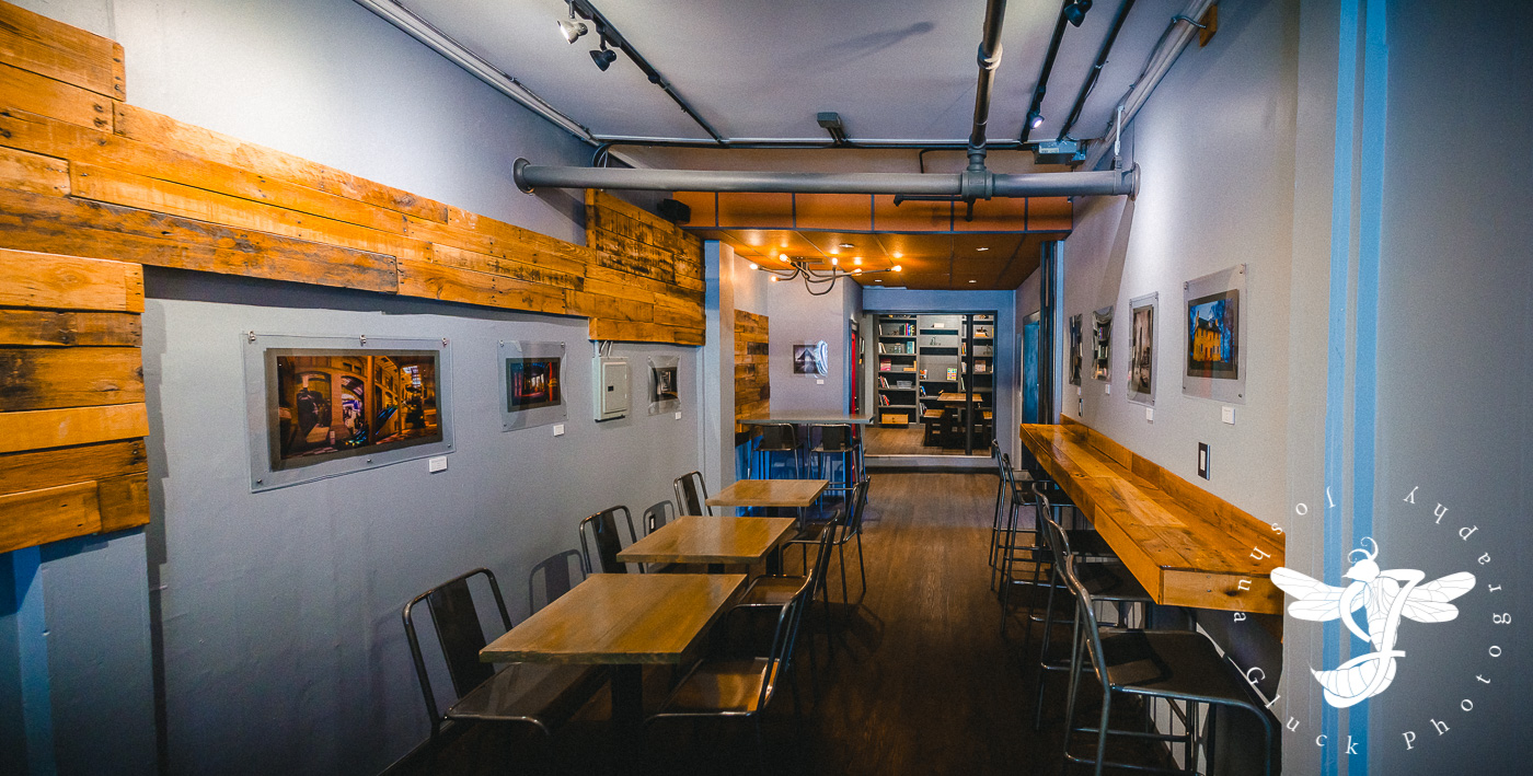
Taste Budd's Cafe is located in Red Hook, NY...not the neighborhood in Brooklyn, mind you...we're talking further upstate, in between Poughkeepsie and Albany. Unlike most other cafes in the area, Taste Budd's had a well established schedule of events, with open mics several times a week, poetry slams, book readings, and-the like. In addition, it was placed close to Bard college, and had a steady influx of students. These factors gave the town, in my opinion, even more of an "artsy" vibe than the Vassar area...and I thought there was a good chance I might have an even more successful showing than the last.
This wouldn't turn out to be the case, as heavily foreshadowed by my early phone conversation with Daniel Budd, the owner and founder of the establishment. In an almost comically matter-of-fact fashion, he emphasized the infrequency of which displaying artists ever actually sold anything. "Well, maybe I'll get lucky", I thought to myself immediately post-conversation.

I had grown quite bored of many of the images I had used in the previous show..having spent countless hours working to get them printed, matted, hung, advertised, sold, etc. Meanwhile, my photo-taking rate had also remained steady that year, and I had a number of new photos I wanted to display. Of course that meant returning to the previous, laborious process of acquiring all of the necessary acrylic, paper prints, and hanging supplies to accommodate the different environment.
A quick side note regarding the acrylic... On both occasions, I had ordered custom-sized pre-cut acrylic sheets from AIN Plastics/ThyssenKrupp in Westchester. While I had no complaints regarding the product quality itself, I cannot emphasize enough the negligence, stupidity, and sheer incompetence presented by most of the staff I dealt with. On both occasions they managed to mangle my order; not cutting all of the sheets to the right size, missing some completely, delaying the order several times, discarding the scraps (despite that I was paying for the order per full sheet, and had specifically requested the leftovers), and forcing me to wait for long stretches of time while they haphazardly tried to correct my order on the spot...this after undertaking the hour-long drive to get there. Suffice it to say I had a lightly heated chat with the floor manager. Did they ever follow up with me to discuss possible compensation? No, and I figured they wouldn't... However the experience as a whole has completely put me off ever wanting to do business with that company again.
But I digress...

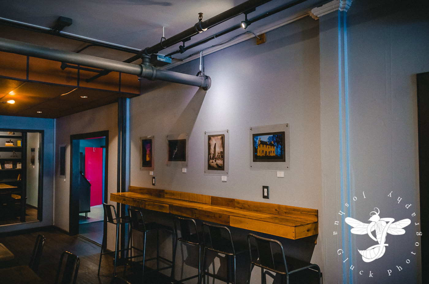
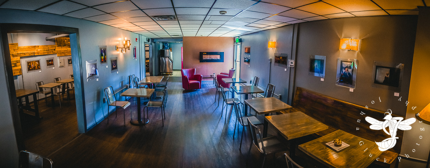
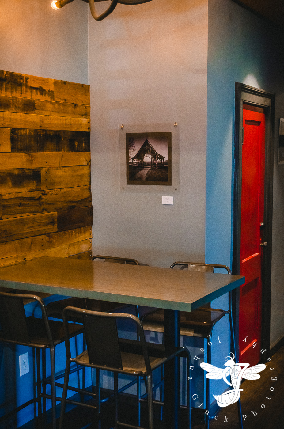
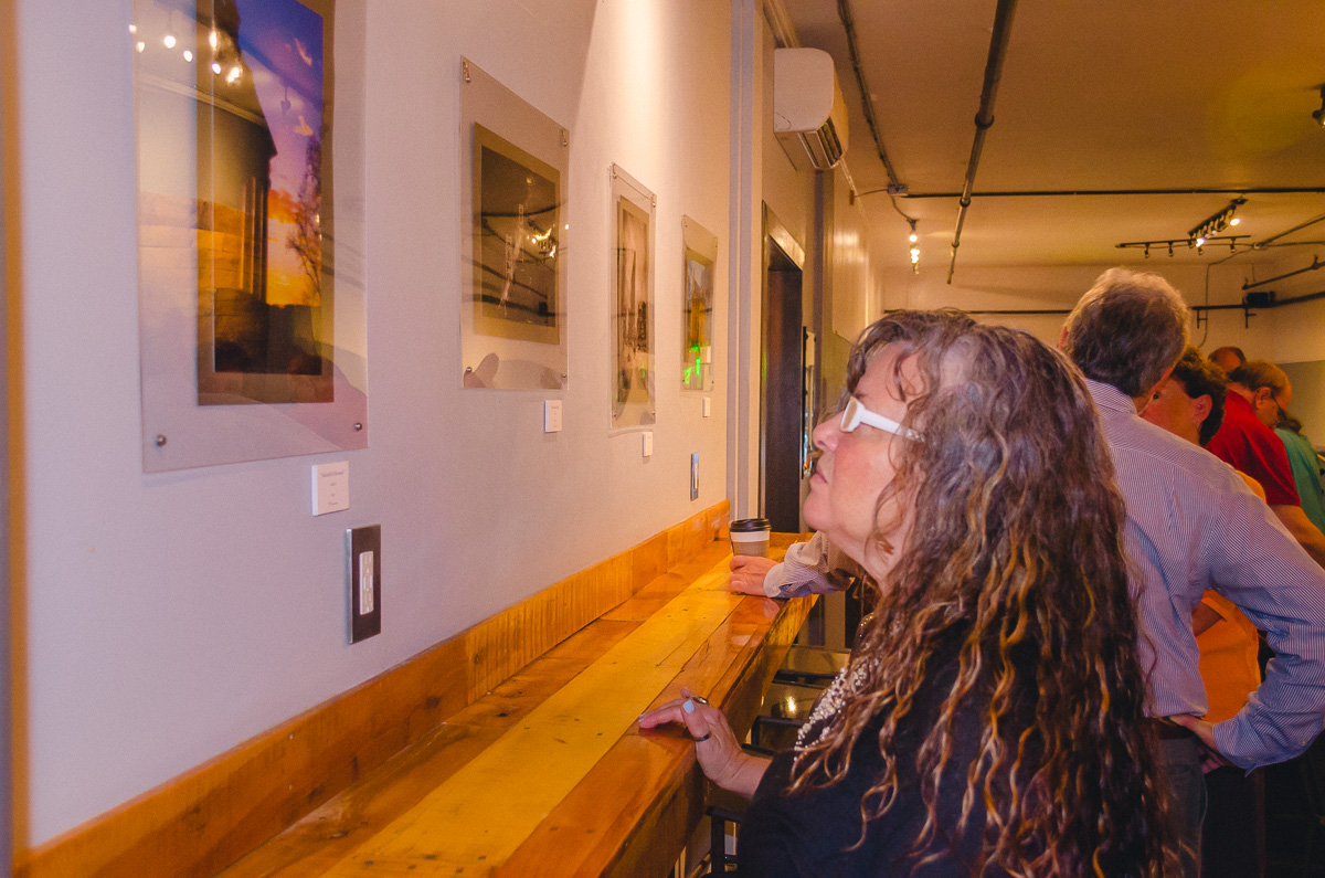
Now, six months following the previous display, and having the benefit of experience...I, with the much-needed help of my seasoned father and my best friend were able to set up *most* of the show within the time-frame I estimated in advance. While Taste Budds is a smaller place than the Crafted Kup, and I wouldn't have to put up as many pictures, the process was complicated by having to navigate around furniture and doorways, requiring us to climb chairs, couches, and a ladder in certain areas. Furthermore, we had generally less freedom to nail the photos to the wall. While it became necessary in certain areas, it was Dan's preference that we used the pre-existing hanging tracks, which required us to jerry-rig a system comprised of carefully measured fishing line and s-hooks. We returned the following night to complete the last few.
The ensuing two months could best be described as lackluster. I received zero calls or comments regarding the prints, or my services as a photographer. I hung a container of 25 business cards and 10 pamphlets on the prominently displayed event cork-board by the door. By the end, 11 business cards remained along with 2 pamphlets...meaning 14 of the former and 8 of the latter were taken in total. By comparison, I began the Crafted Kup showing with 25 business cards and 15 pamphlets. All of the business cards were taken within the first week, along with half of the pamphlets. Over the course of that show, I restocked both a couple of times. By the end I must've gone through close to the full 50 business cards I had on hand. None of these resulted in further inquires, sadly...but the difference in general interest between the two cafes was staggering.

And of course, to top everything off...a day before the show was to come down, I received an e-mail from Dan informing me that they were going to begin repainting the walls, and "some" of my art had been taken down early. Given the delicateness of the frames, I was a little unnerved that I hadn't been informed in advance so I could do it myself...but I figured that I could spare getting worked up over a few pieces.
I arrived the next morning to discover that "some" actually meant that every single image had been removed and stored tightly in a box behind the counter, with little padding to prevent scratching. I irritably repackaged everything and went on my way, leaving with an unfortunately sour experience, from beginning to end.
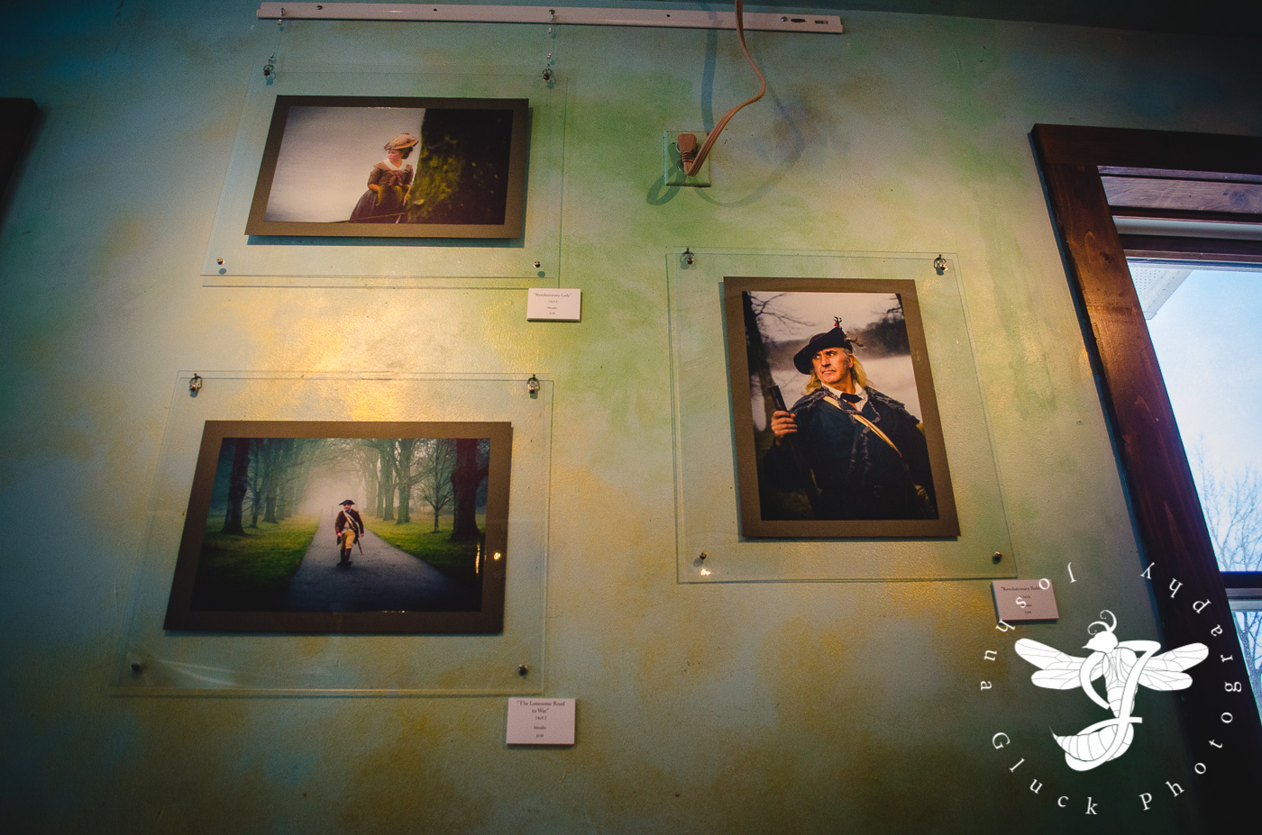
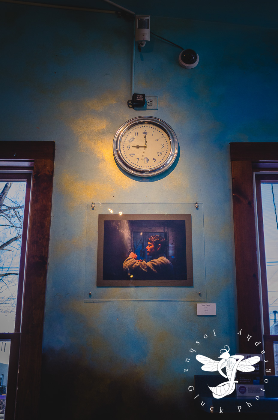
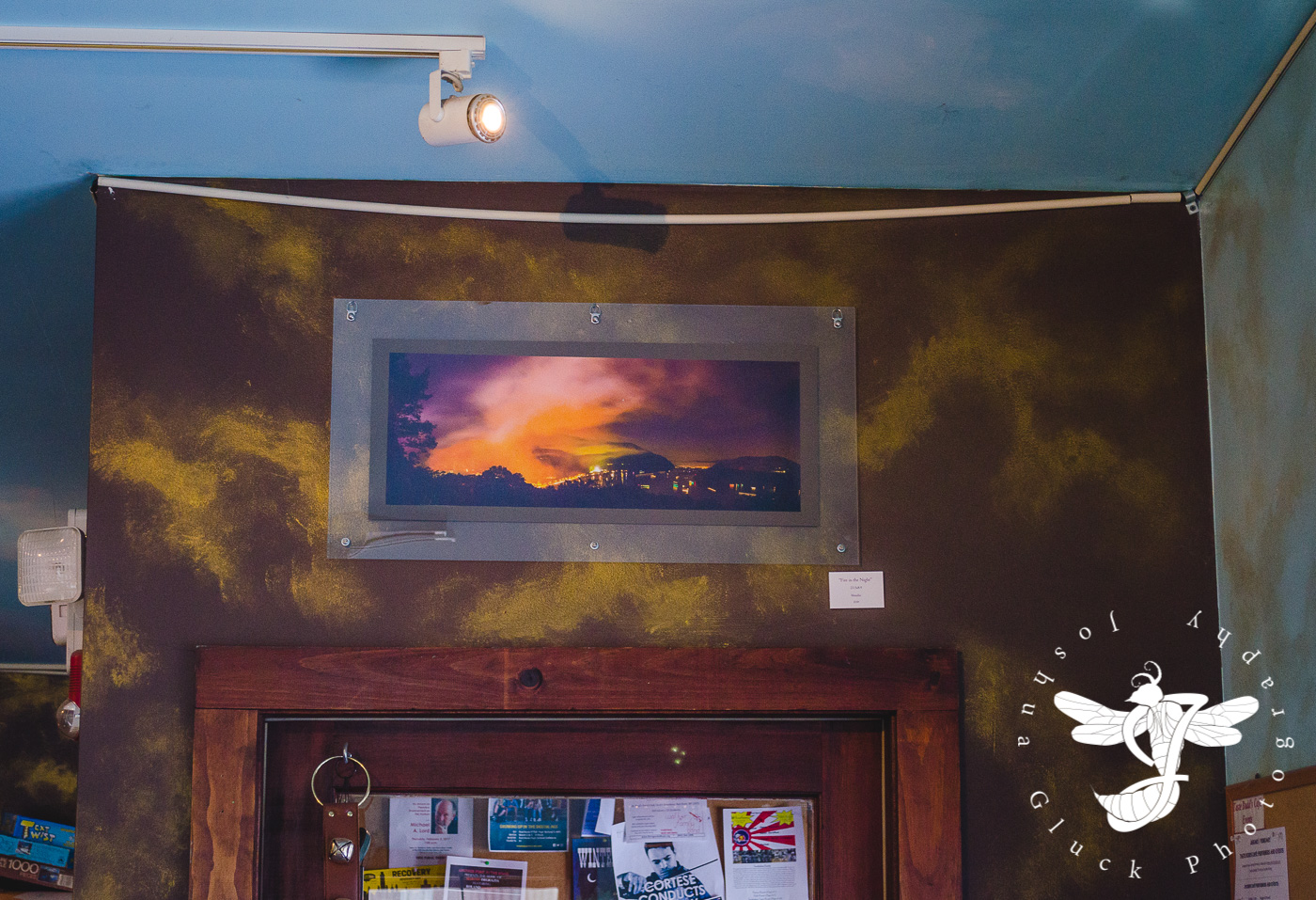
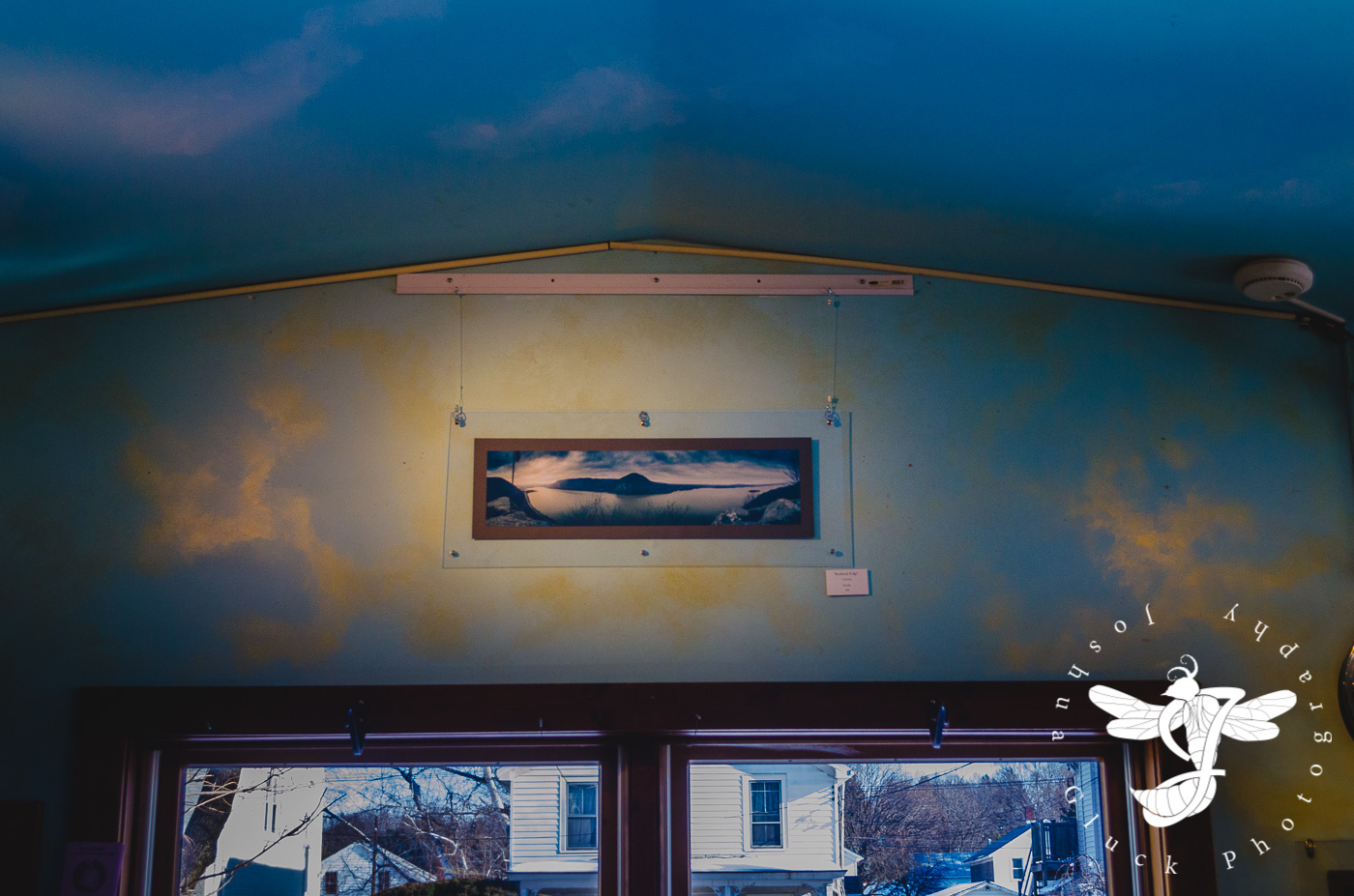
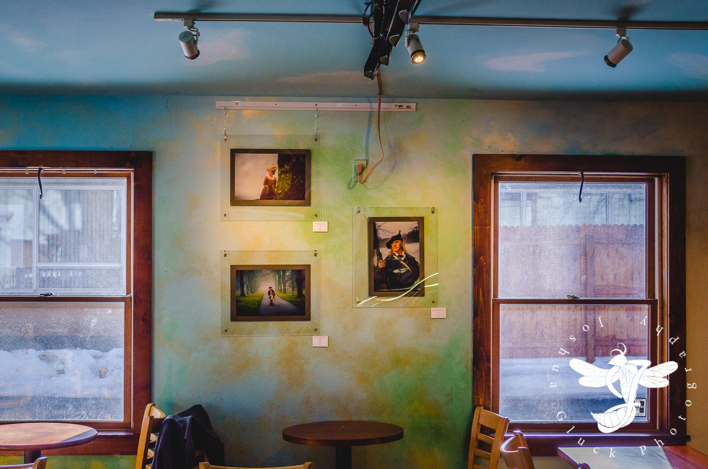
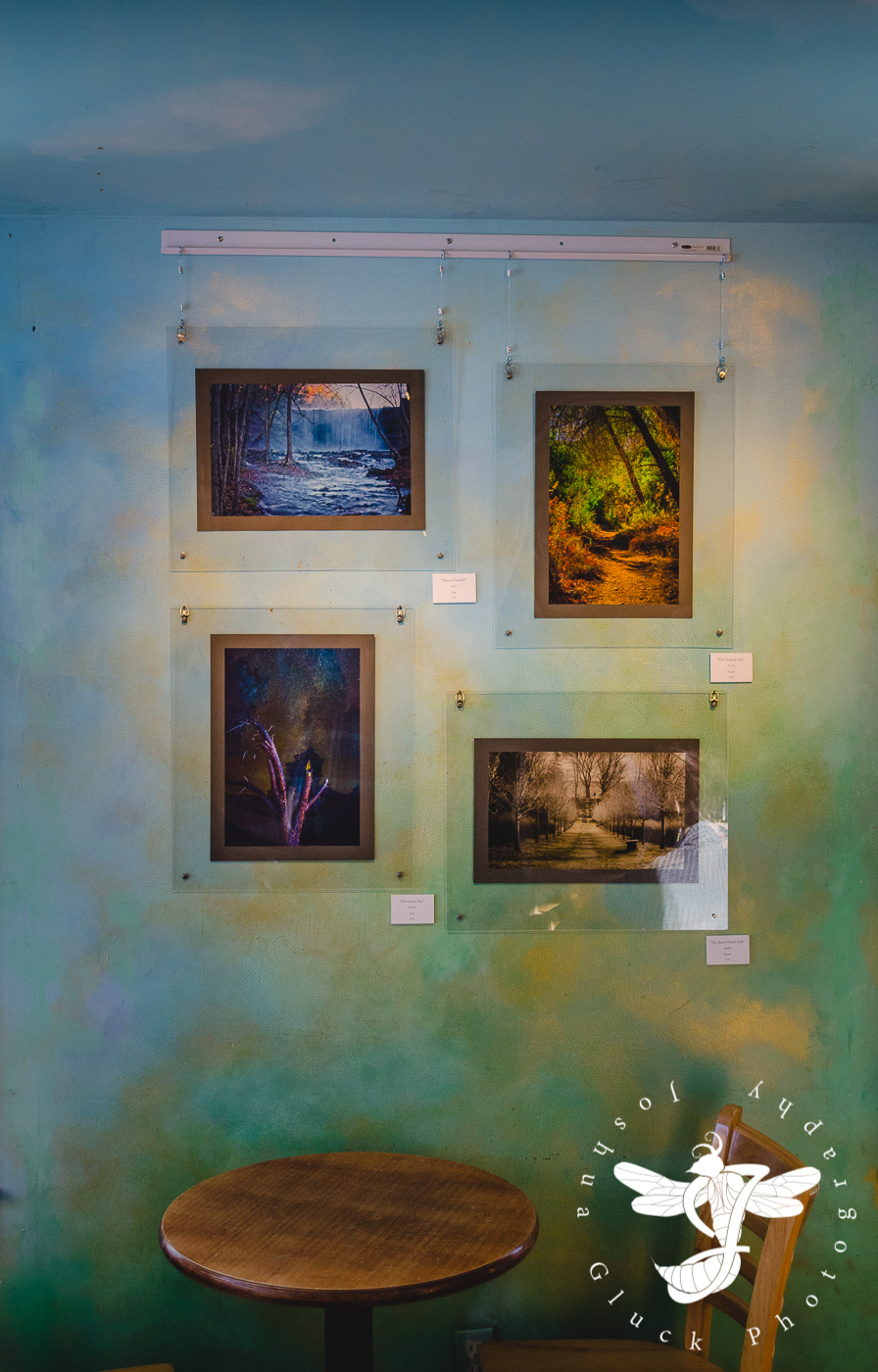
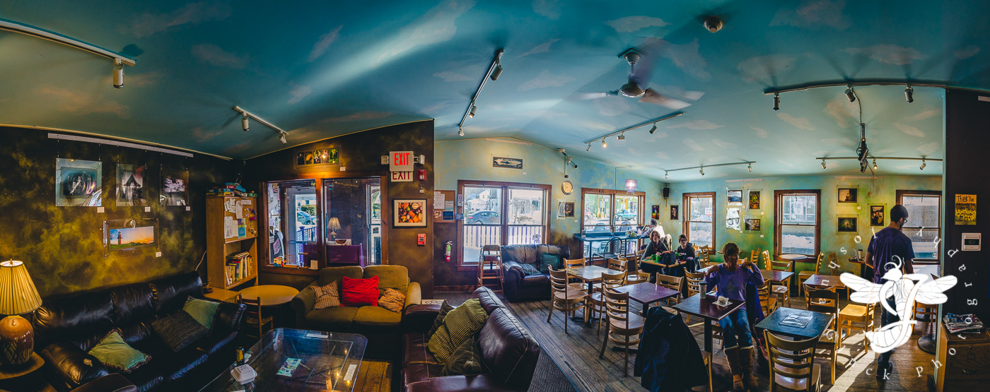
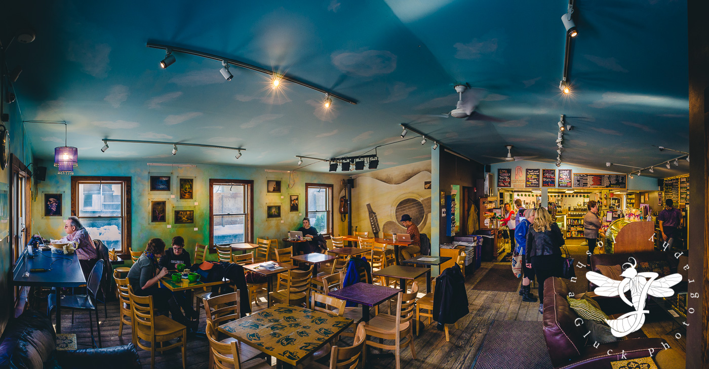
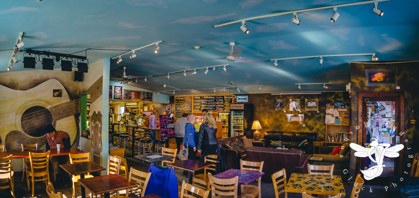
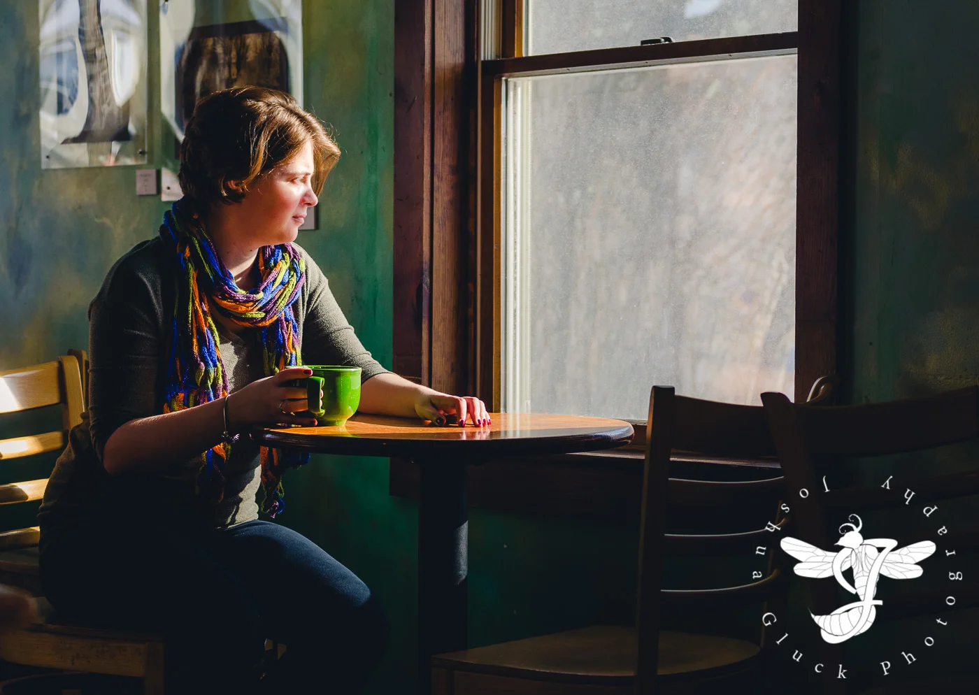

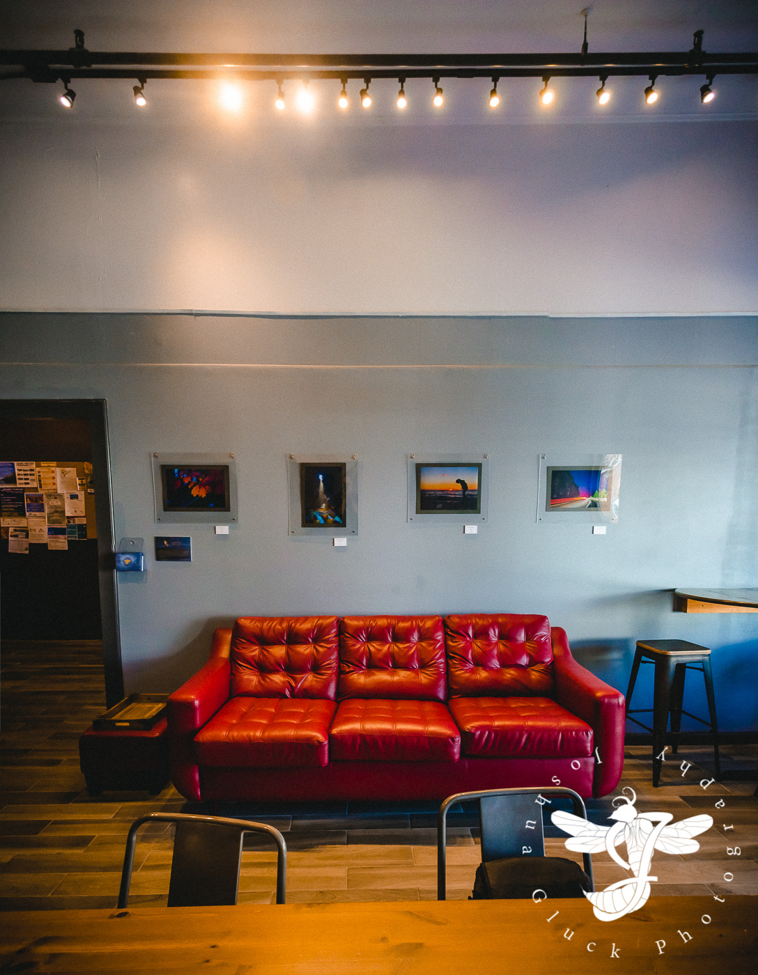
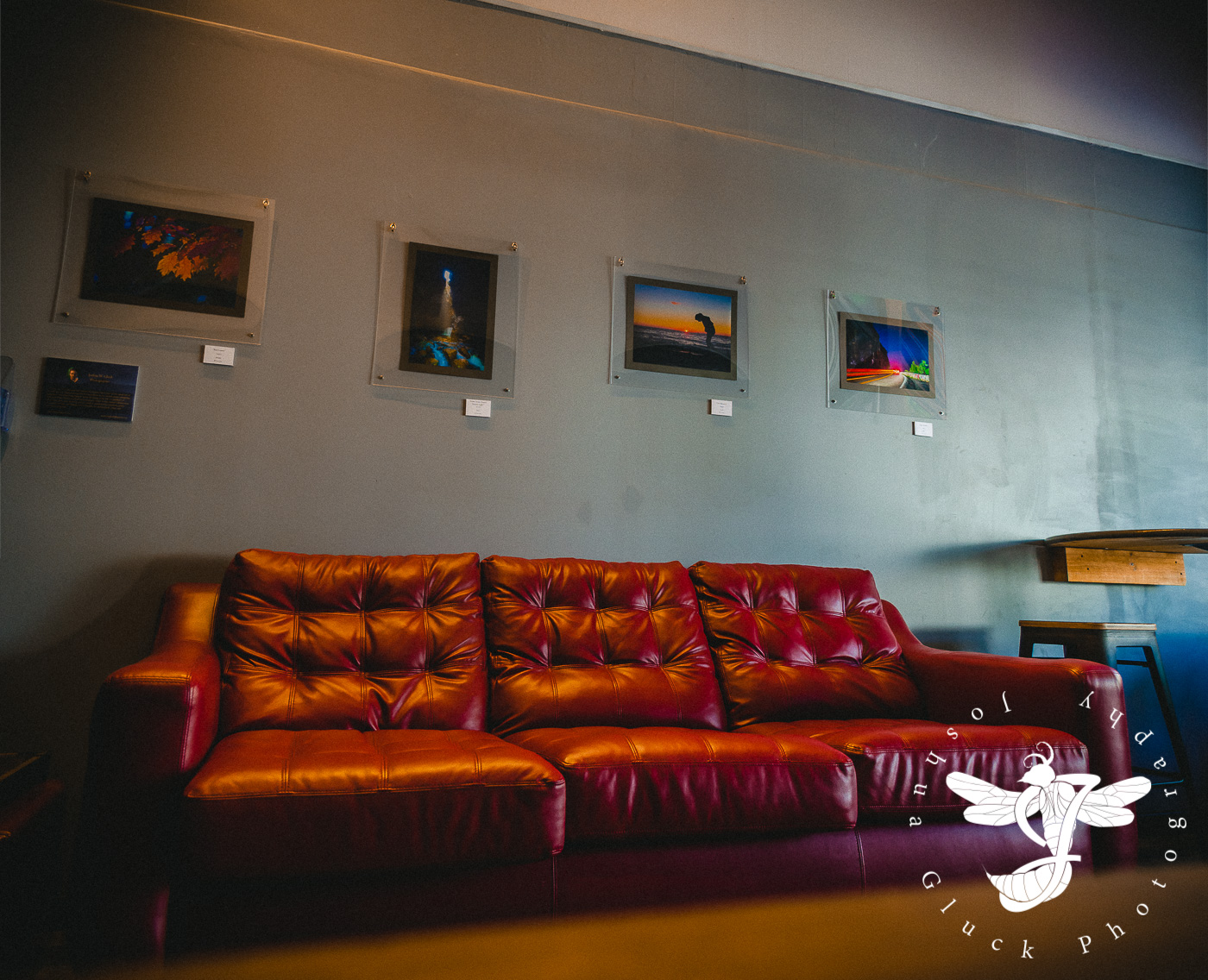
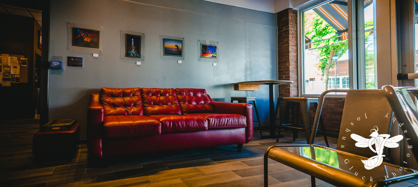
Photo Exhibition #1 - The Crafted Kup
I've lived in the Hudson Valley since I was eight, and It's only been in the last three years or so that I've actually taken the time to explore it.
...I'm a bit late on this one.

The Crafted Kup - Circa 2016...after the renovation.
I've lived in the Hudson Valley since I was eight, and It's only been in the last three years or so that I've actually taken the time to explore it.
Towards the end of 2014, The Crafted Kup was recommended to me as a suitable location for a first date with a girl I had been talking to online (which went incredibly well, I might add). At the time, the place was only one narrow hall, furnished with a hodgepodge of second-hand couches and chairs in a variety of different styles. There was artwork hung on the wall in no particular layout or pattern. The place was quaint, but I didn't pay much mind to it at the time...it certainly wasn't my primary focus that night.
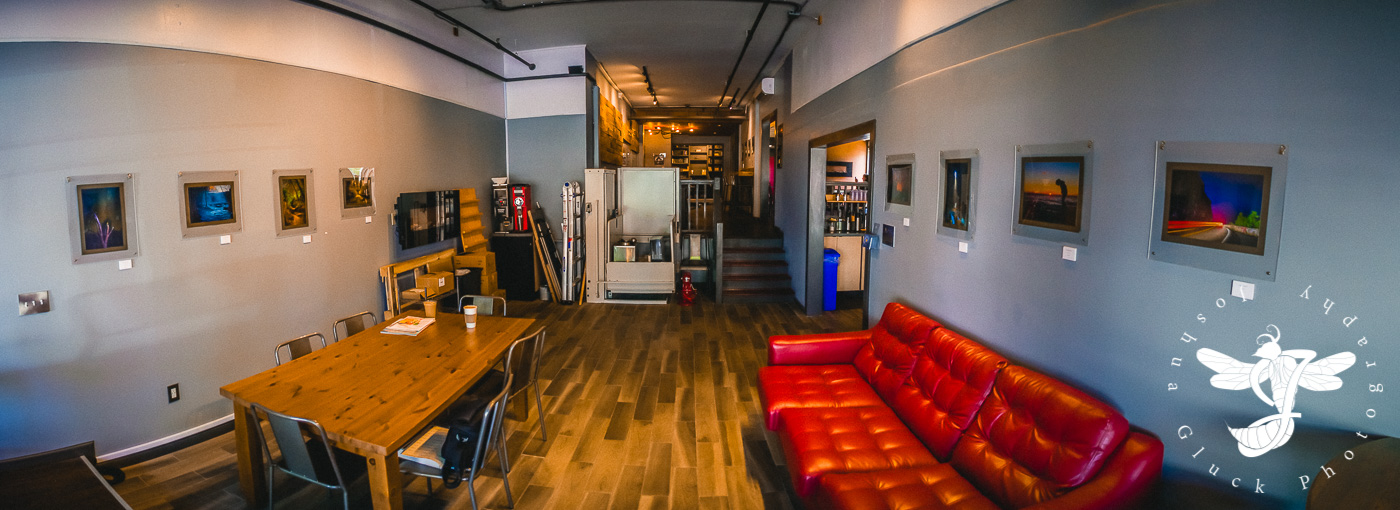
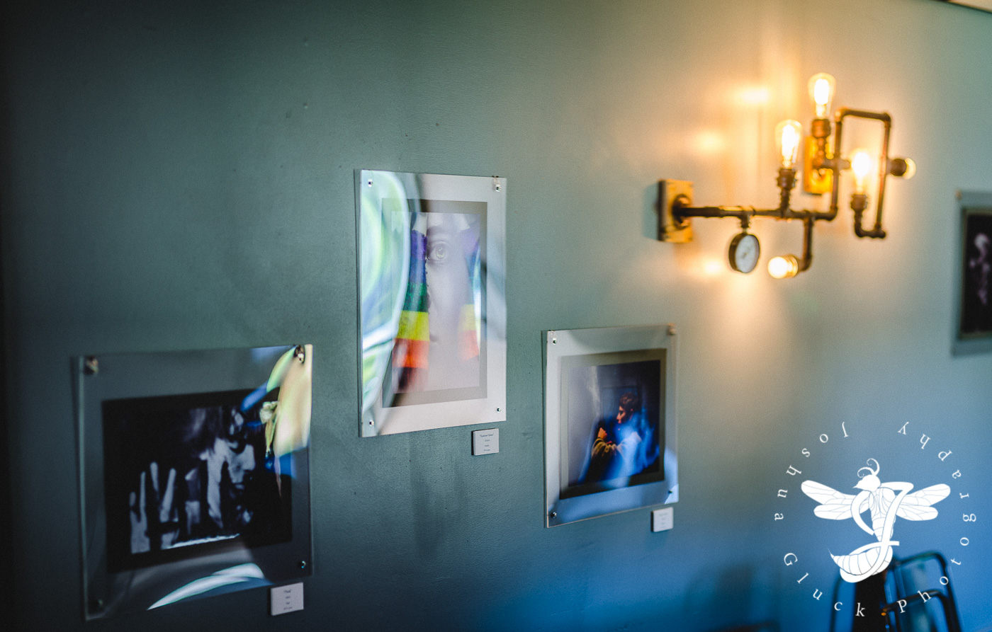
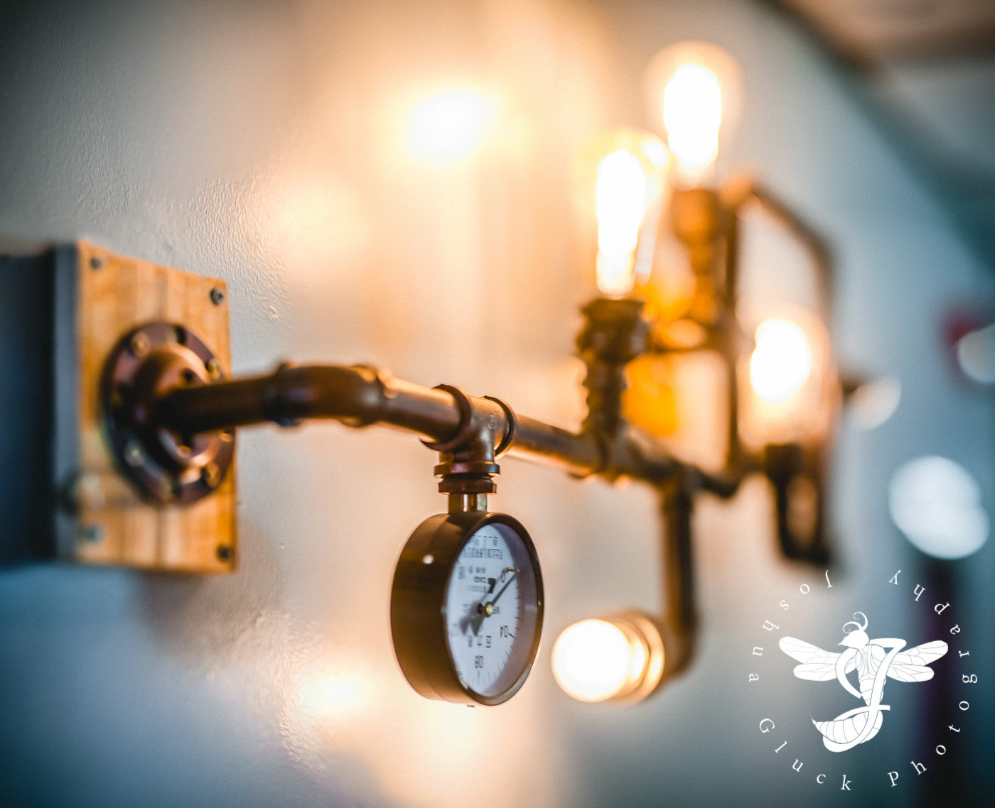
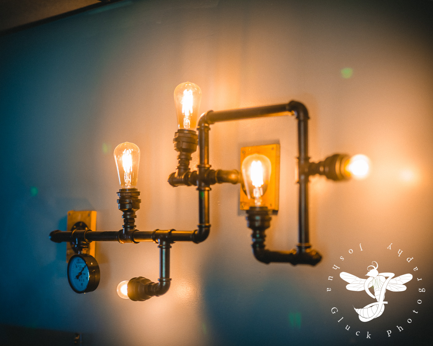
I returned to the cafe nearly a year later (2015), when they were in the midst of a dramatic renovation. Gone was the raggedy furnishing, and in its place were shiny metal chairs, laminated wood tables, steampunk-esque Edison light fixtures, and flat, slate blue walls. If that wasn't drastically different enough...the owner, Tanner, had purchased the location next-door and expanded the cafe into it, easily doubling the size of the place, making room for more tables, leather couches, and a reading area.

The updated aesthetic...
There was certainly a significant amount of additional wall space, complete with track lights spotted around the ceiling...possibly intended for the eventual display of local artwork.
During the period of mid 2015 into early 2016, my interest in photography, which had up until that point been merely a past-time, increased dramatically. I spent many early mornings and late afternoons searching for interesting landscapes and architecture. By spring 2016, I had a largely usable portfolio of new images, and I also devoted time searching through older photos and re-editing them to match the quality and aesthetic I had developed over the years.

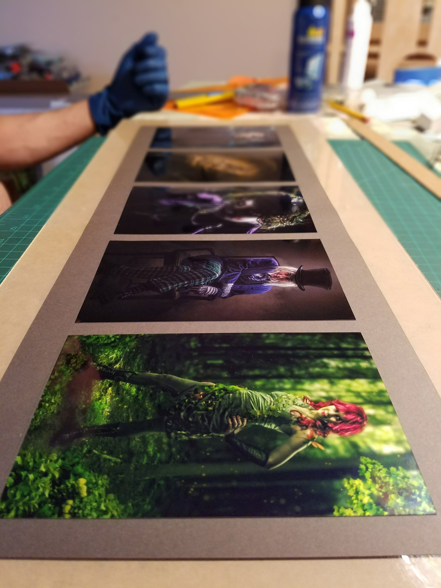
This particular show consisted of 30+ photos spanning seven years of work (2009-2016).
In mid-Spring 2016, I approached Tanner about potentially displaying my photography in the not-too-distant future, and he was fortunately very accommodating. What followed were several busy, somewhat stressful months trying to put together my first photography exhibition. May I just say...what a learning curve.
There was quite a lot to work on in a somewhat short amount of time:
1) Selecting a reasonable amount of photos for display out of over a hundred.
2) Finding and testing a reputable professional printing service.
3) Framing...which I'll get into momentarily.
4) Retrofitting my long-outdated website to accommodate a photography shop.
5) Designing business cards and pamphlets.
6) Designing a logo for said business cards and pamphlets.
7) Price Cards
Tasks 1, 2, 4, and 7 went reasonably smoothly...if perhaps a bit tediously.
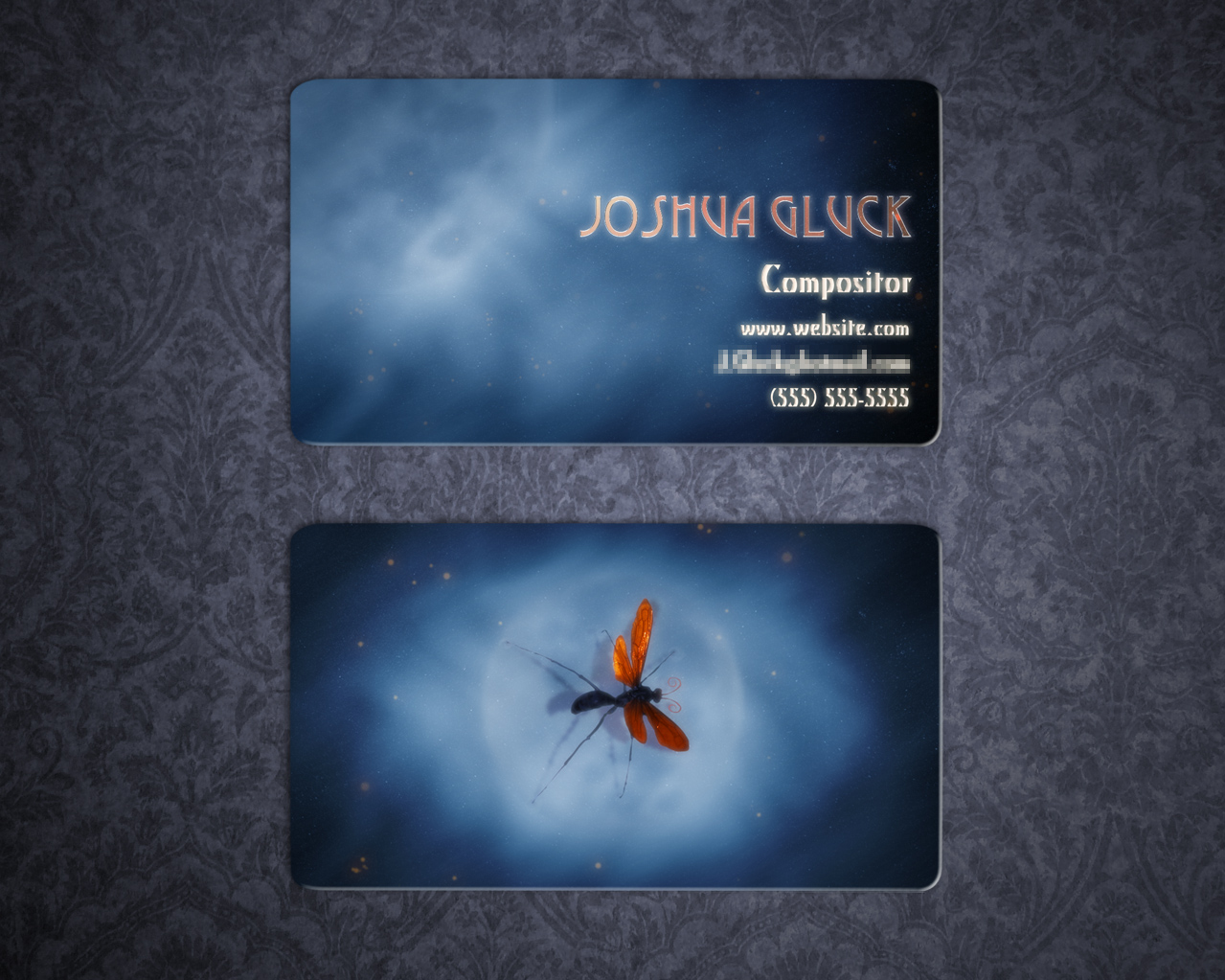
My logo was actually finished in one very long night. I wanted to use the Tarantula Hawk Wasp idea I had developed in college (I'd be damned if I used a lens, camera, or aperture design)...but how to implement it? I realized that if I angled it correctly, the wasp's body silhouette could actually be shaped into a "J", which was fitting enough. Over the next few hours, in between working on some of the other list items, I'd return to the wasp and send out my latest version to several people for feedback.

The progression of my logo over the course of a single afternoon/night.
Iteration 2 lacked any interesting detail, and the stinger was described as "too aggressive". It was also mentioned to me that the wasp by itself didn't read as a "J" as well as I was hoping. After some experimentation, I was able to wrap a cursive "J" around the wasp like a ribbon, making the whole design flow a bit better. Some detail work later, and VOILA! My first proper logo.
Now for the business card...
Back in 2012, at good 'ol Full Sail University, we had a preparatory class just prior to finals in which we were required to design all sorts of branding items, such as business cards, dvd cases (I suppose I'm dating myself here), and website layouts.
My half-hearted 2012 business card mockup.
These never amounted to anything though, due to my "break" in the years immediately following. This time, a full 4 years later, I needed to give the design some more serious thought.
In the 2012 version, I had always planned to have the wasp's orange wings printed in gold foil. For the new design, I expanded that idea to the whole logo, as well as the lettering. I also liked the blue/orange contrast, so I maintained the general aesthetic and color palette of the background...albeit making it a bit simpler. In addition, I thought it'd be handy to have an easily scannable, custom QR code on the back that linked directly to my website shop.

The printing process required the gold foil stencil and image backgrounds to be submitted as separate files.
Naturally, I pre-vized the design using MAYA.

The final product (a newer iteration incorporating VFX promotion).
The price cards were trivial. I batch exported all of the titles and prices into a few sheets, which were then printed onto cardstock, glued to foam core, and cut out into their final rectangular shapes.

My stack of completed price cards...perhaps the easiest thing to design for the event.
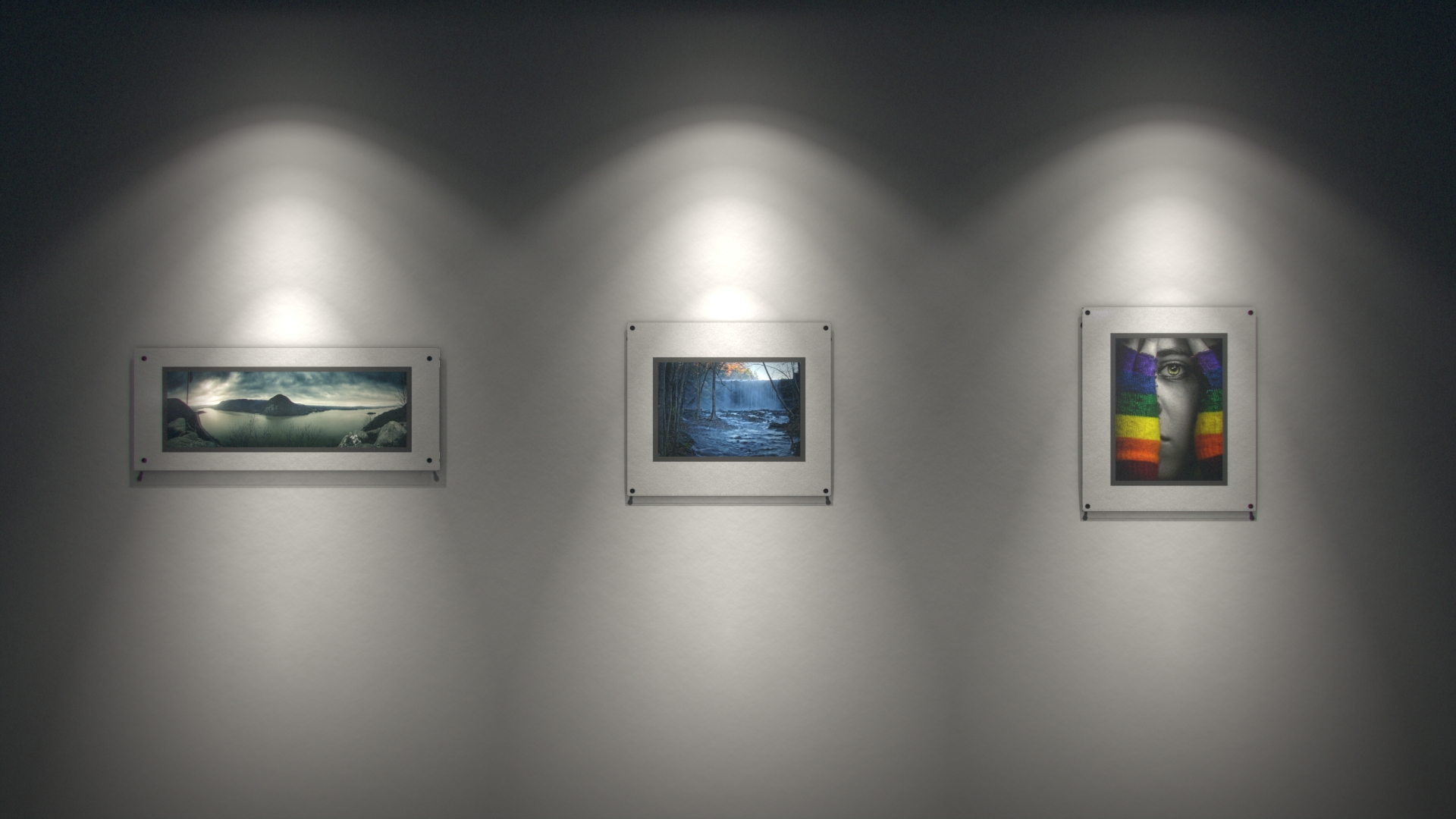
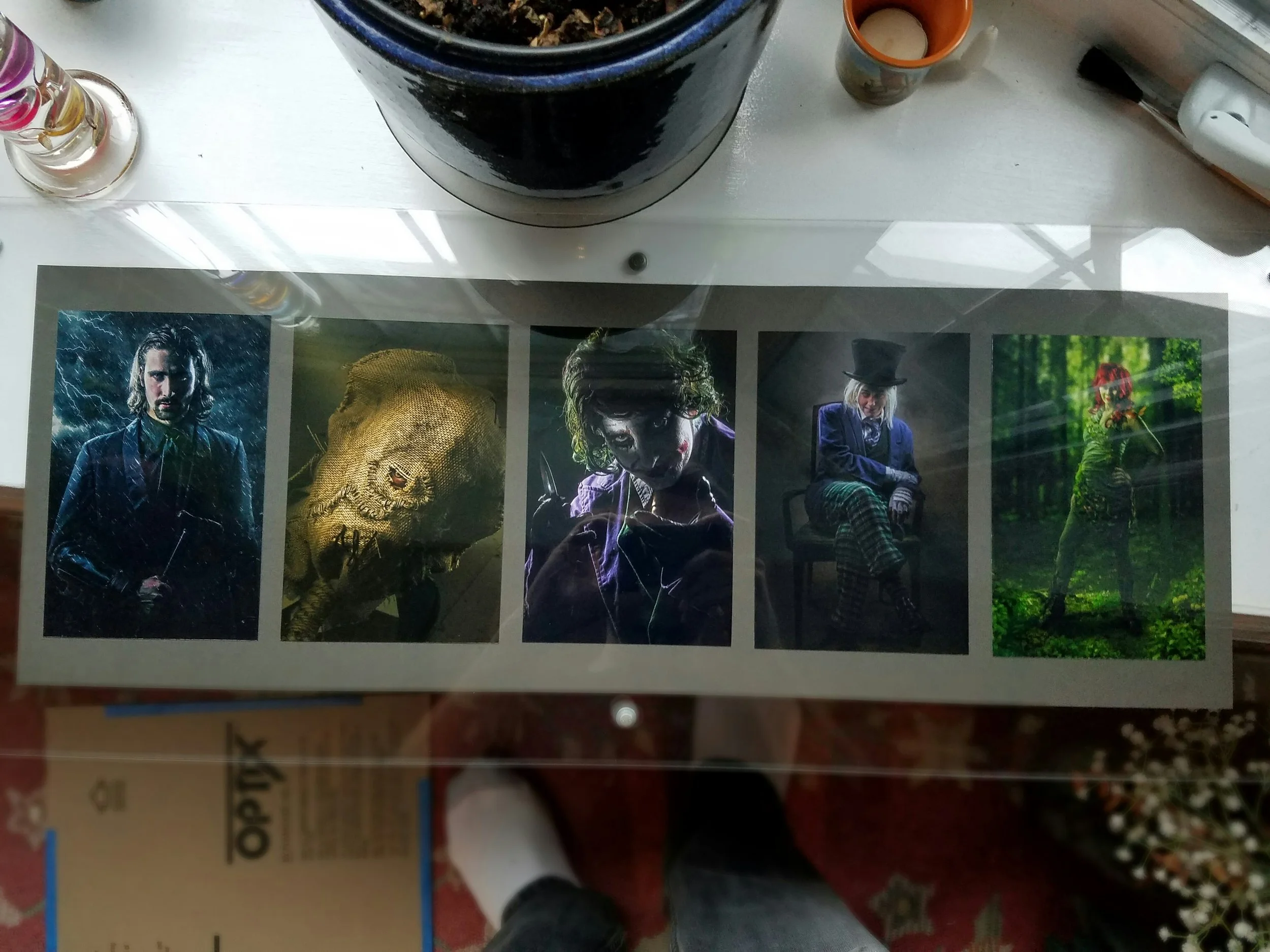
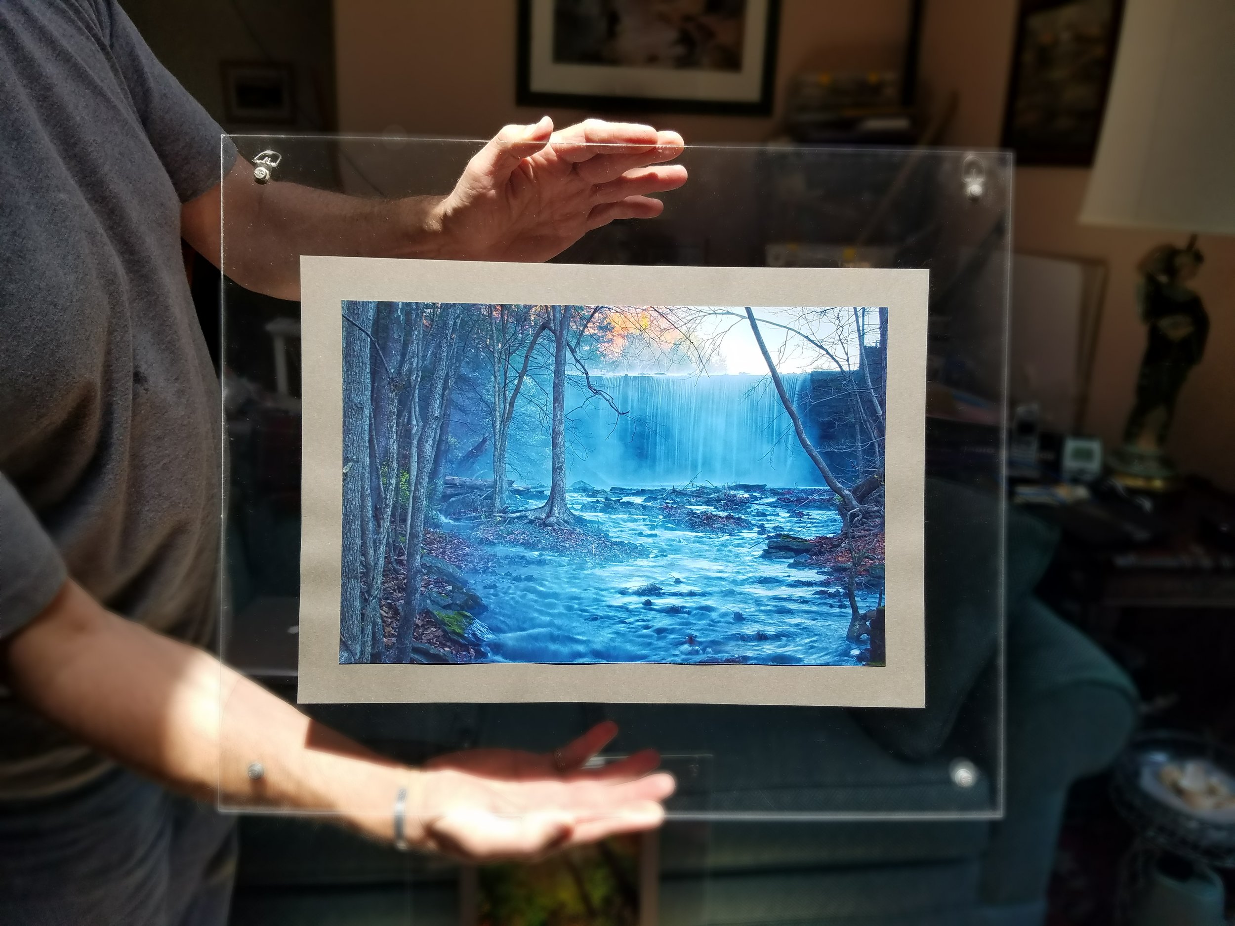
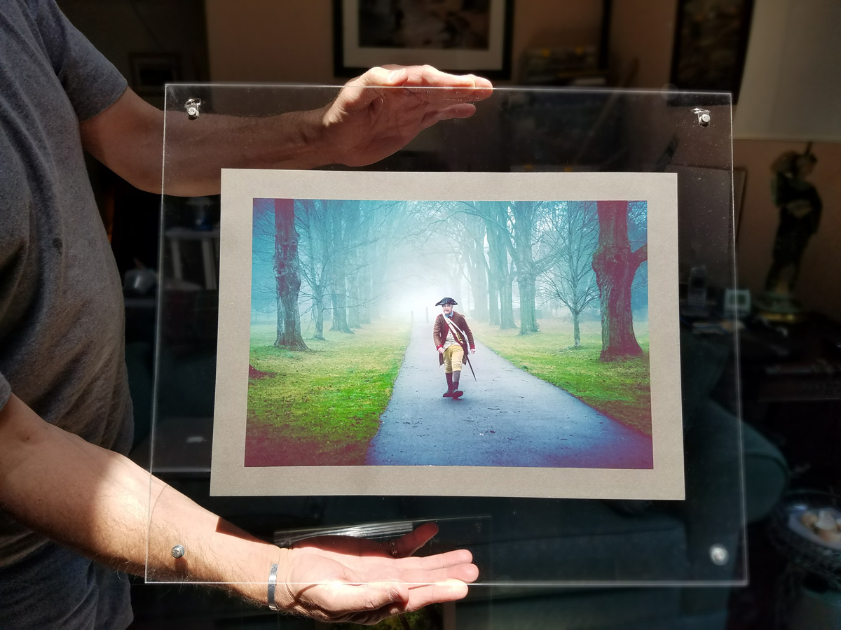
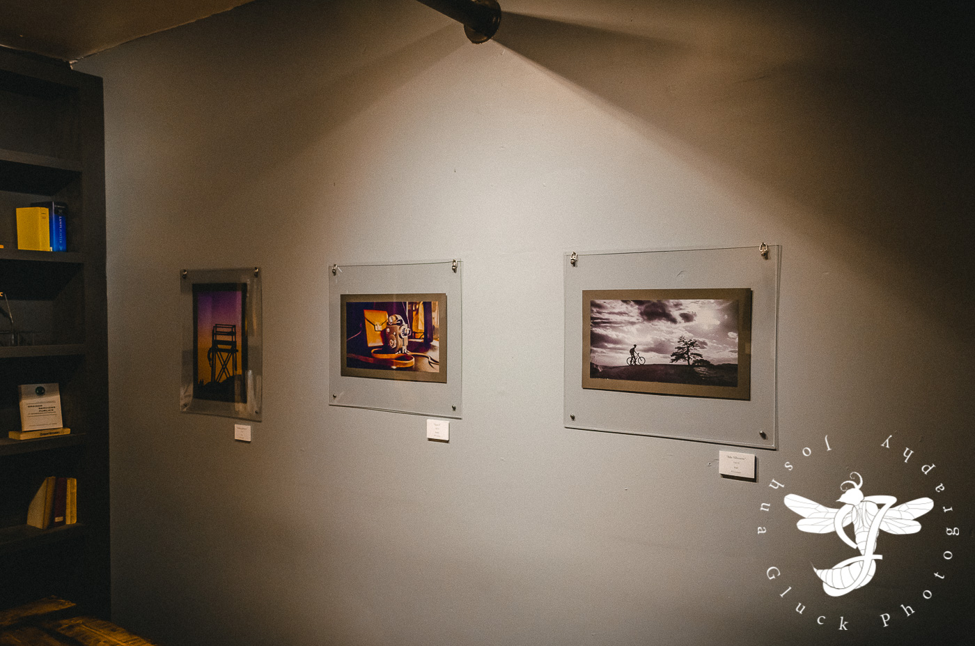
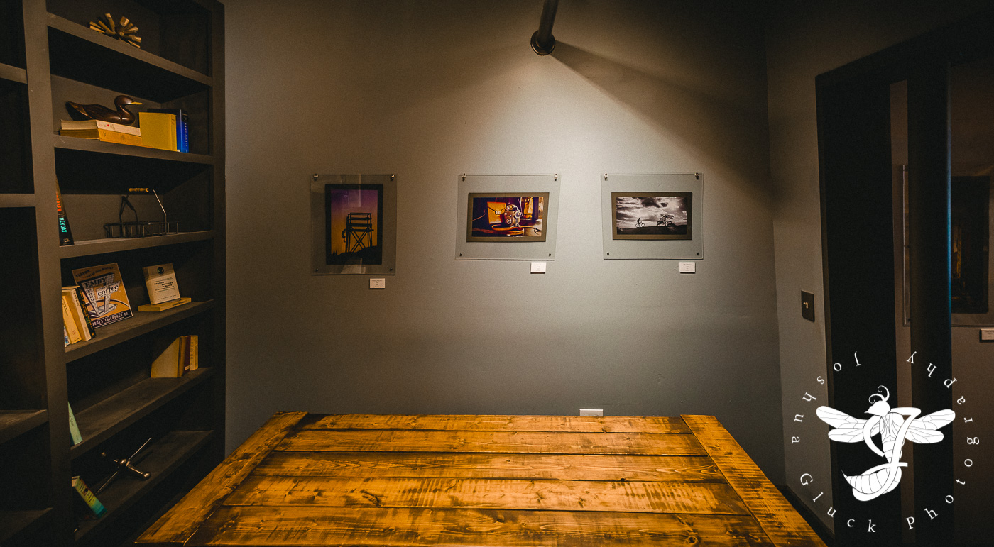
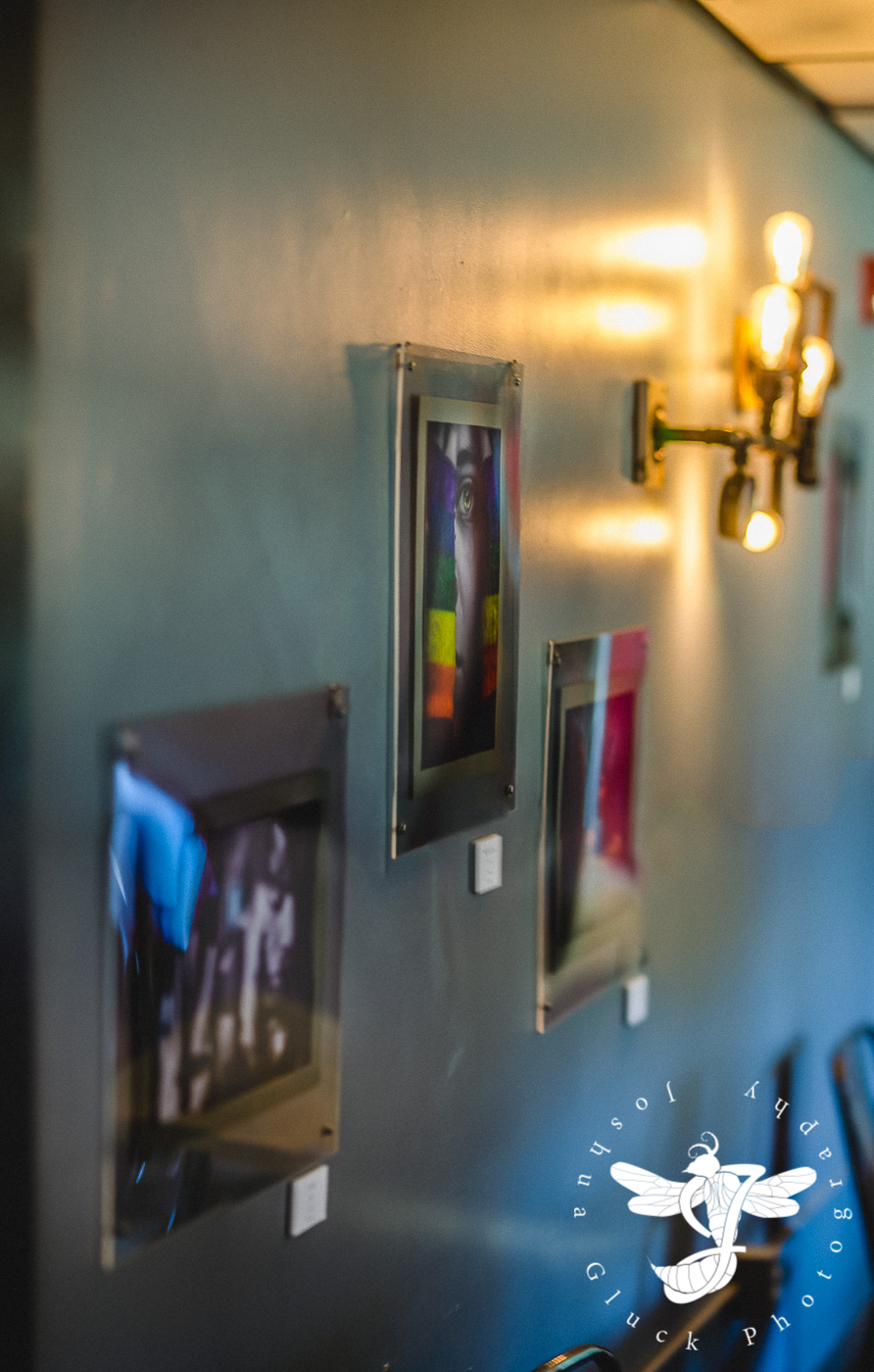
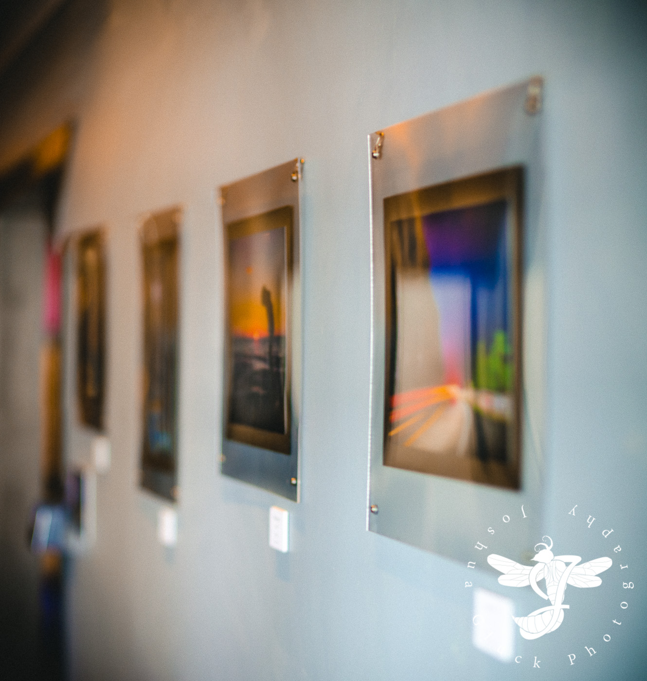
With the business cards and price cards complete, the primary task left was the framing. I had intended to buy basic, everyday frames for the sake of price and simplicity. However, my ex-photographer father (who was in the business professionally for 27 or so years) insisted on designing something more unique. He wanted to suspend the prints between two sheets of acrylic, giving them a modern, sleek, floating appearance. After a lot of nagging, I relented...so following a mind-numbing amount of measuring and planning, we purchased a plethora of acrylic sheets and got to work, drilling out screw-holes in all four corners of every single piece. Each print was very carefully stuck onto a specifically picked gray paper backing, and then sandwiched between the acrylic. Even the screw-heads were carefully chosen to match the aesthetic. The entire process took us several days to complete the 30+ prints.
More pre-viz!

It was very relieving once we finished the first pictures. It's nice when a plan works.


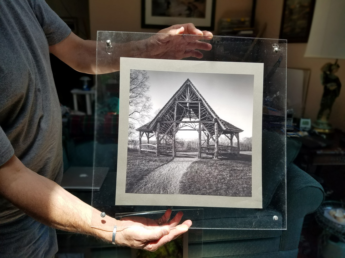
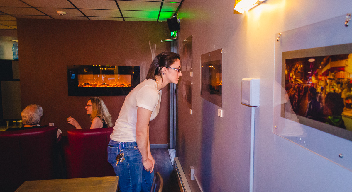
With all the photos successfully framed, my father and I traveled to the cafe on a quiet night in July, and hung everything on the walls. Two nails for 11x16 photos, three nails for panoramas. Are they level? Equally spaced? Grouped correctly? There was much to consider...the whole process took upwards of 4 hours...well past closing time.
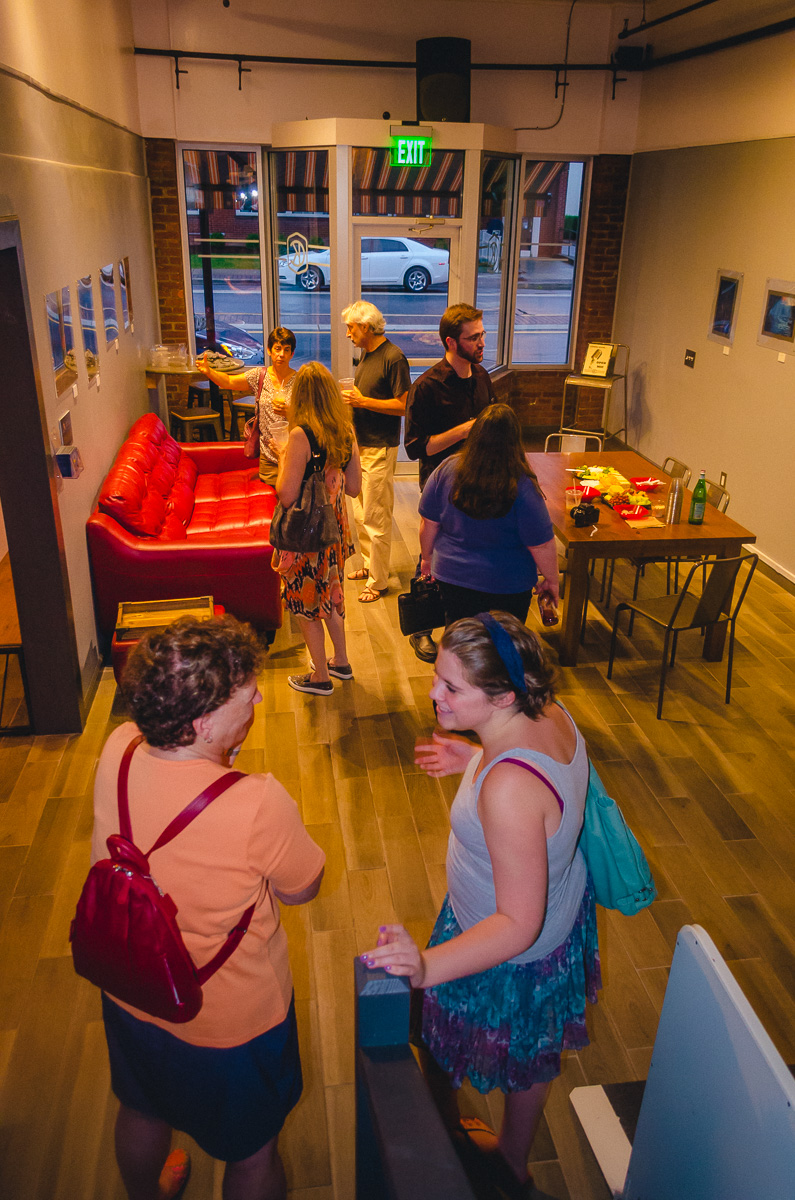
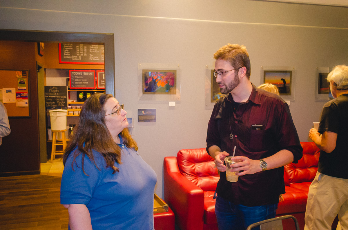
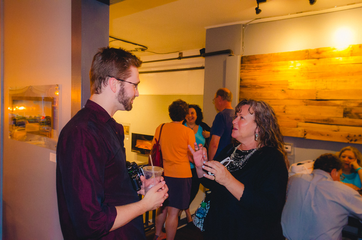
And with that out of the way, my opening reception took place the following weekend, and the prints remained hung until early September.
8 prints sold. 👍

The remaining prints are, as I write this (2/18/17), hanging in a different cafe further north. I'll write more about that (and more briefly) in a separate blog post.
Was this experience rewarding? Certainly. Will I just use normal frames the next time I have to start over? Yes. Or I'll have a professional service bond the prints permanently to single acrylic sheets. Either way, I'm happy this work is behind me.

HYPERSPACE
Back in October, the third Star Wars trailer came out and included a shot of the Millennium Falcon entering hyperspace.
Feeling inspired, I decided to make a little video of my own showing off this effect.
Back in October, the third Star Wars trailer came out and included a shot of the Millennium Falcon entering hyperspace.
Feeling inspired, I decided to make a little video of my own showing off this effect.
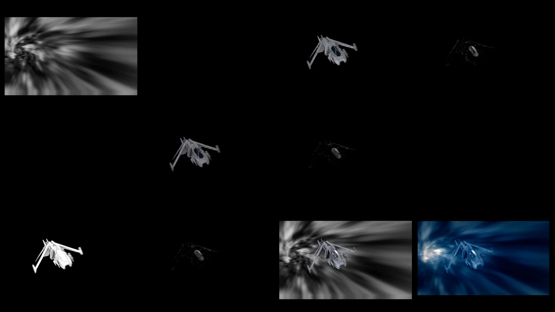
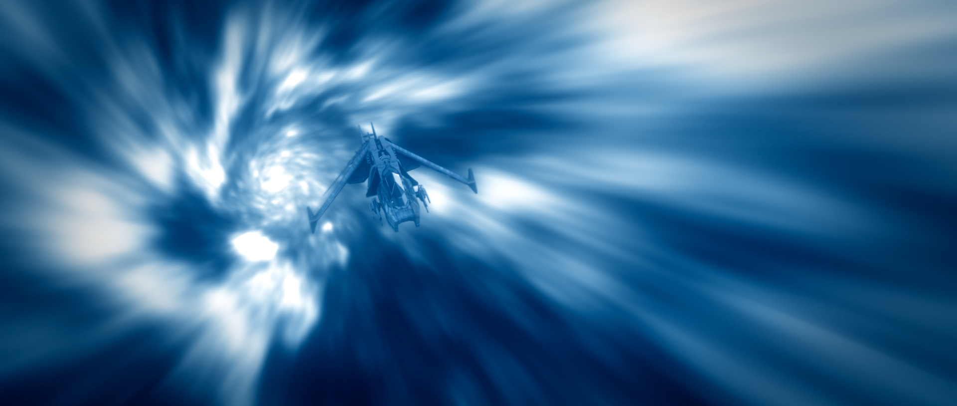
FIRST OFF: My initial animation playblast. I animated a fractal pattern in After Effects like I've done in other experiments for the vortex, and the model was an old, incomplete favor by my friend Cameron Ake (https://vimeo.com/45412817) that I touched up a little specifically for this video.
The initial playblast.
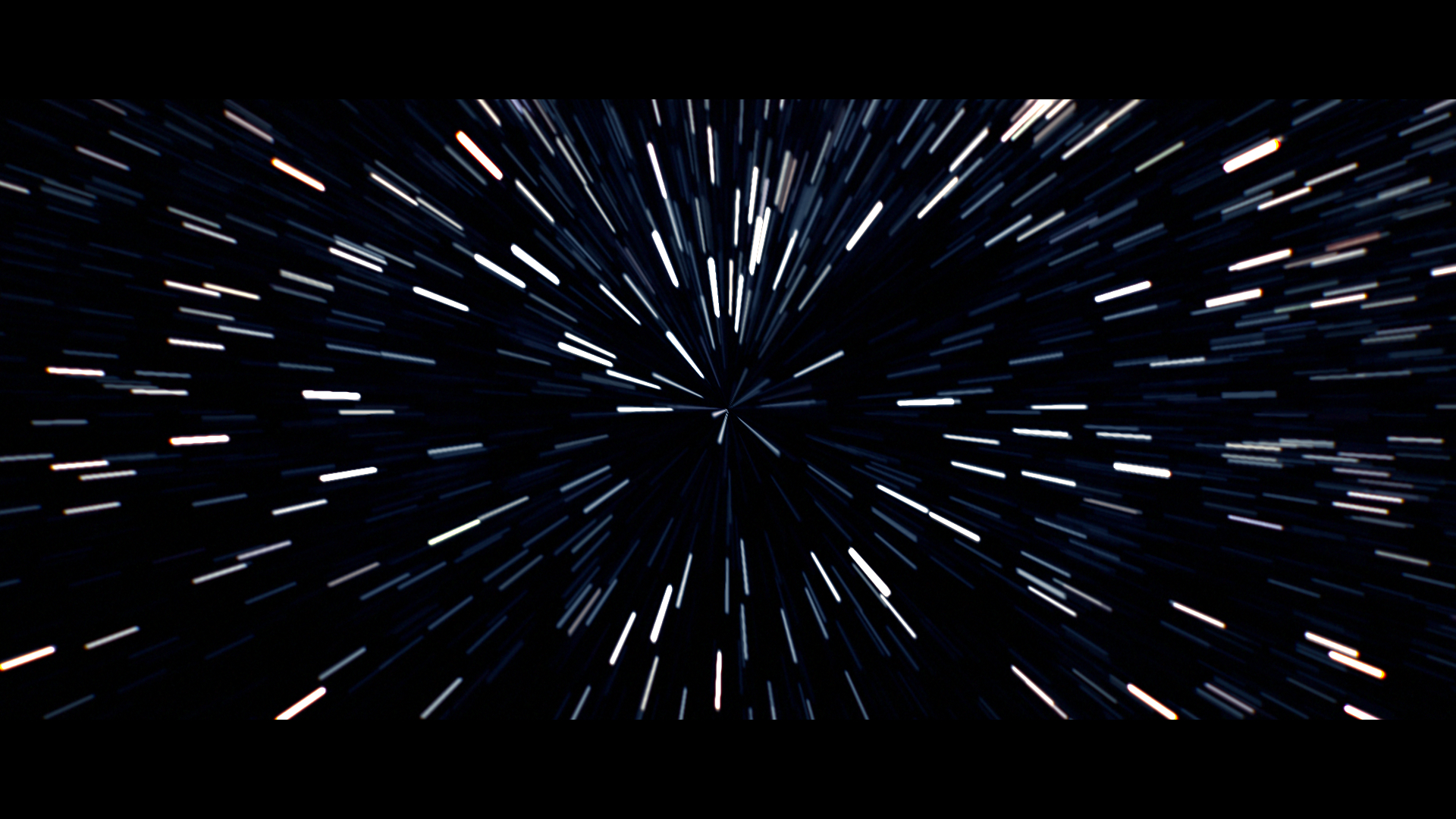
Originally, I had planned to have the shot end mid-pan like it did in the trailer, which left me with this render (minus the opening star stretching, as I hadn't decided on a method yet):

Hyperspace V1
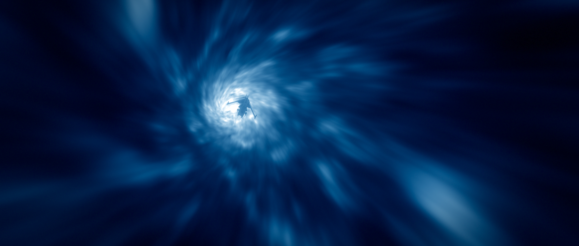
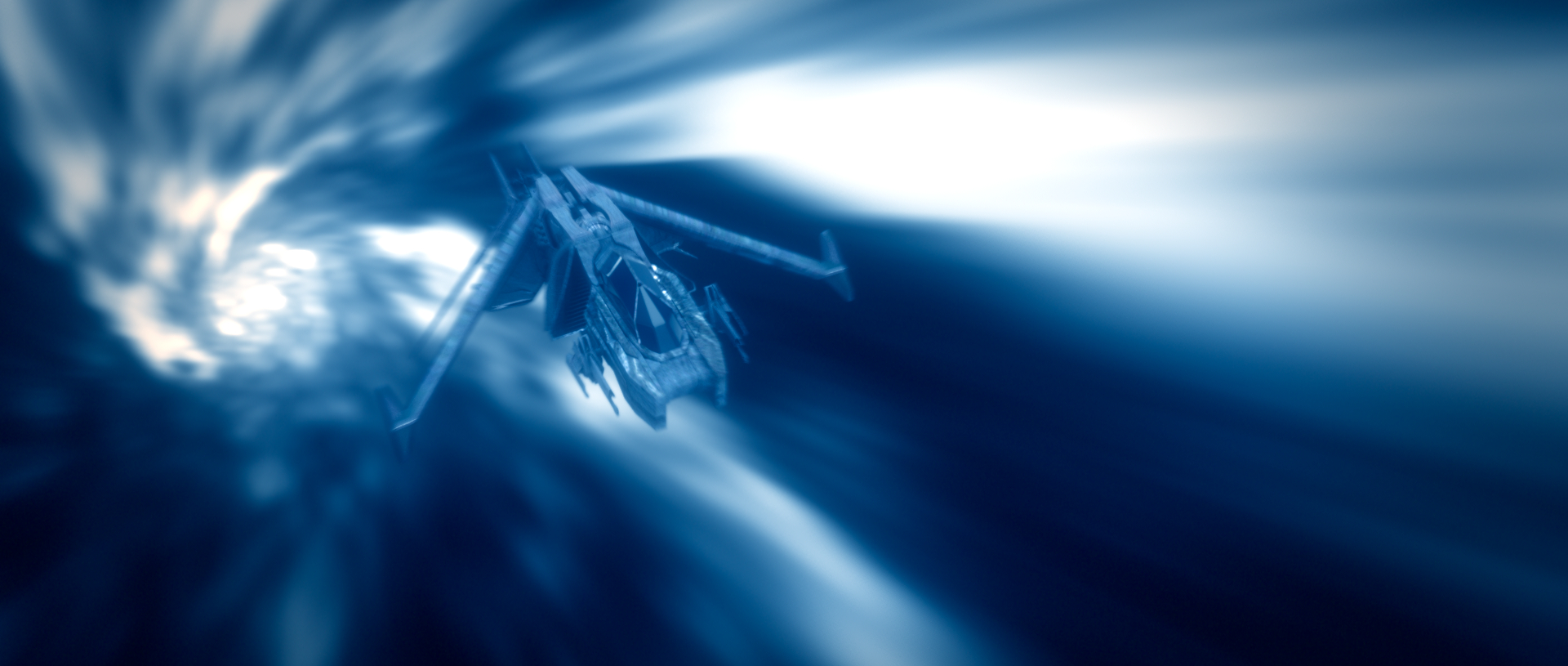
After I had finished, I thought about my previously-made Earth model, and though it'd be fun to use it. So, I extended the sequence, having the ship exit hyperspace in front of the planet.
Before I had time to render my own model with the lighting I wanted, I used an actual picture of the Earth as a placeholder:
Early hyperspace exit test with a proxy Earth.
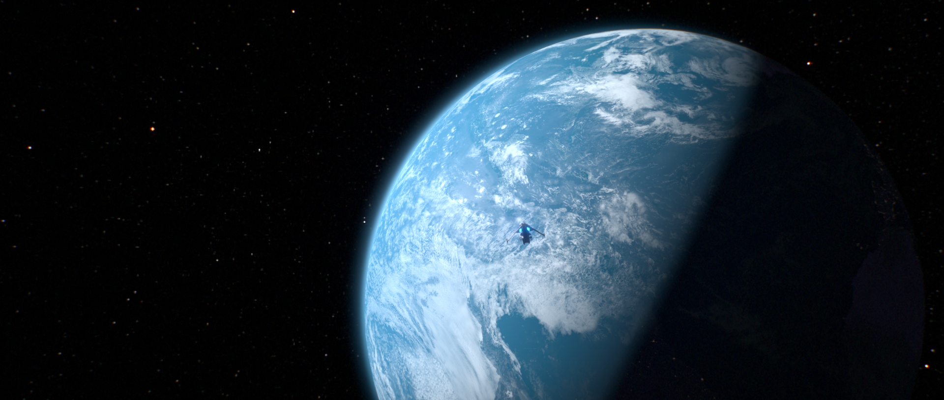
Not long after, I successfully rendered out everything, and, using a slowed-down version of the music from the trailer, made a sound mix for the video.
THE FINAL RESULT:
A fun little clip inspired by the hyperspace shot in the recent Star wars 7 trailer. The ship model (albeit currently a WIP), was modeled by Cameron Ake. Everything else was created by me, including the Earth model.
And the BREAKDOWN VID:
Hyperspace layers: broken down.
There are definitely things that could be fixed, such as the abrupt Earth stopping motion (accidentally caused by forgetting to switch a keyframe from a "linear" tangent to "flat", and not feeling patient enough to re-render), and a couple of other small things. But I really didn't/don't feel that making those changes would be justified for a little experiment such as this, since I can't really use it on my reel anyway...given its (obvious) similarities to the actual movie.
Funny thing is, about two weeks later...THIS shot was shown in a Disney behind-the-scenes video. It's a wonderful similarity.

Mine on top (made without knowing or seeing the actual shot from the film).
The actual ILM shot on bottom.
And for a few various frame captures:


Constraints Experiment
A vital part of being a good animator is being able to animate constraints, whether it be for handling props or simply just parenting one body part to another. This piece was created specifically so I could properly learn how to do this. I'm still a little uneasy with it...but I'd say this specific experiment was successful, and quite a lot of fun to top it off!
A vital part of being a good animator is being able to animate constraints, whether it be for handling props or simply just parenting one body part to another. This piece was created specifically so I could properly learn how to do this. I'm still a little uneasy with it...but I'd say this specific experiment was successful, and quite a lot of fun to top it off!

My original set of renders.
A couple of days after I finished the above renders, I decided to play around with Maya's bonus time remapping tool....and of course I realized the opportunity to turn this into a matrix bullet time-esque shot. I, and several people I showed this to, ended up preferring it over my original...so this is what went into my actual reel:
The same animation, now with time-remapping and a moving, spinning camera.
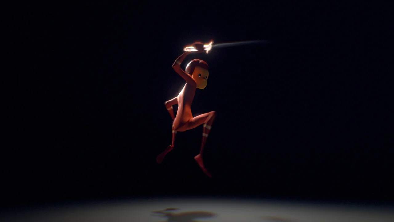
And to add to the fun....
I had volunteered to rotoscope some lightsabers for another member of the VFX community who was participating in the annual Lightsaber Choreography Competition. After spending a solid 4 days roto'ing, I was in a very lightsaber-y mood...so I created an alternate version of the animation for amusement:

The same animation...now with lightsabers!
Also for fun, a contact sheet showing the different render layers I used for this. Pretty straightforward.